Liniaprosta
Identity for an architecture studio from Warsaw.
Client: Liniaprosta
2015
Project info +
Project realized with the Turbodizel design studio.
In collaboration with Filip Krynicki (programmer).
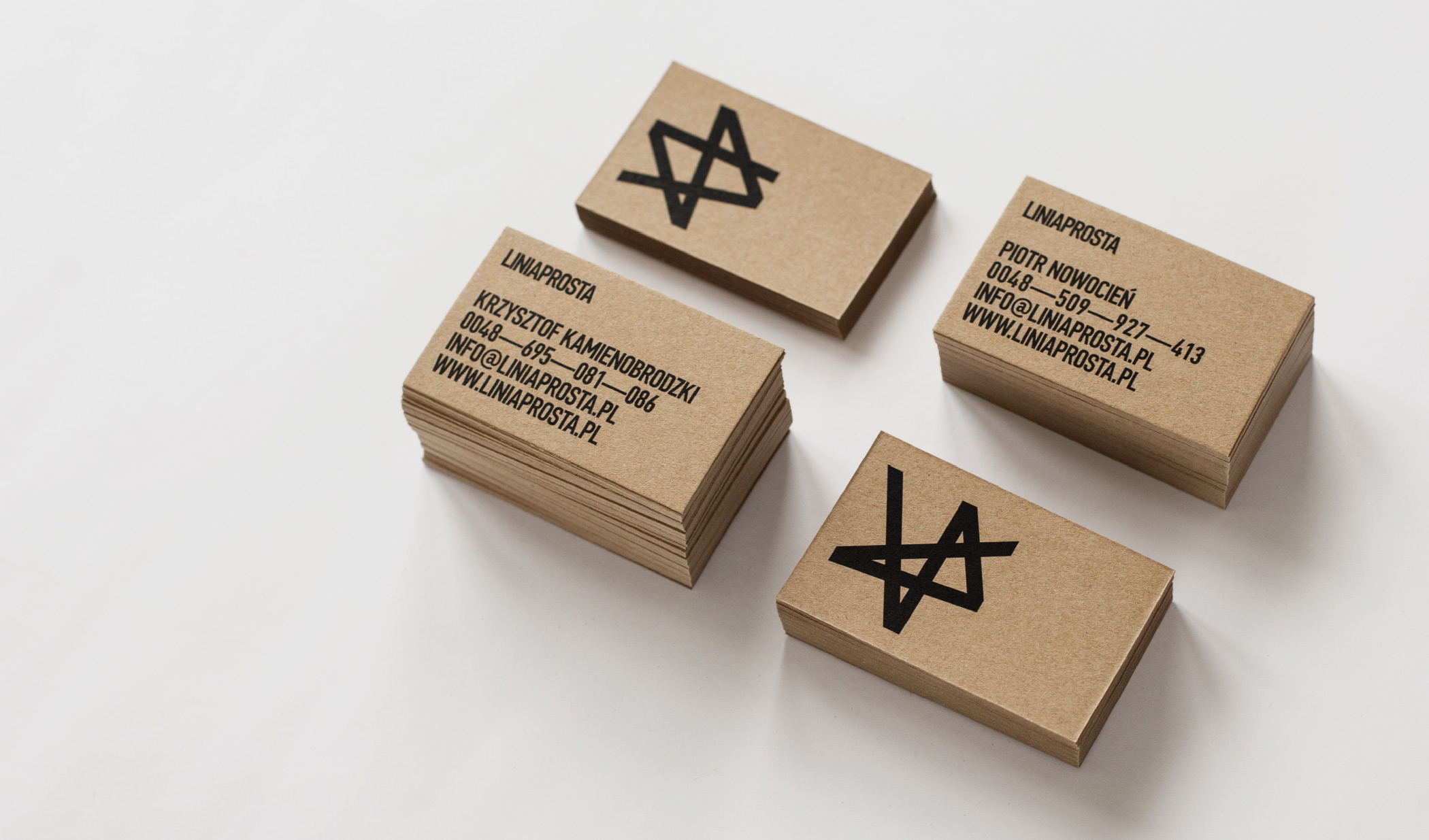
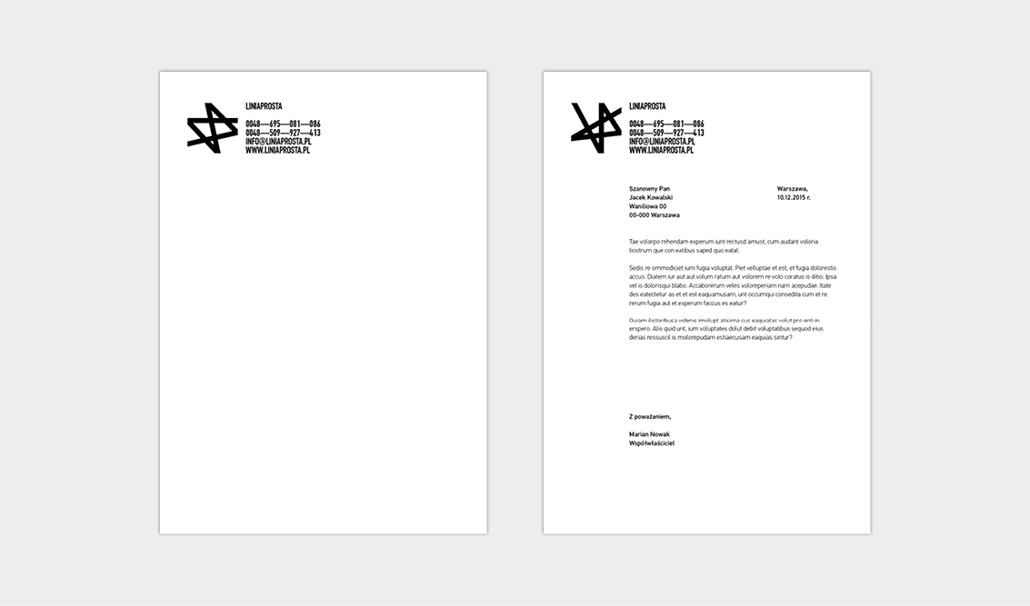
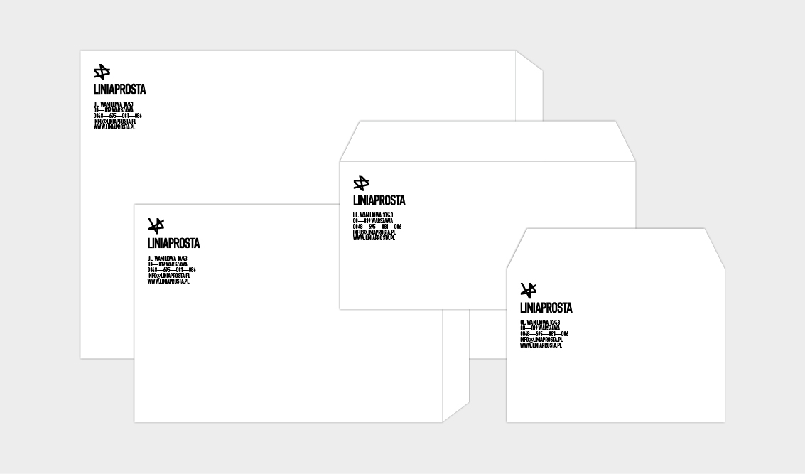
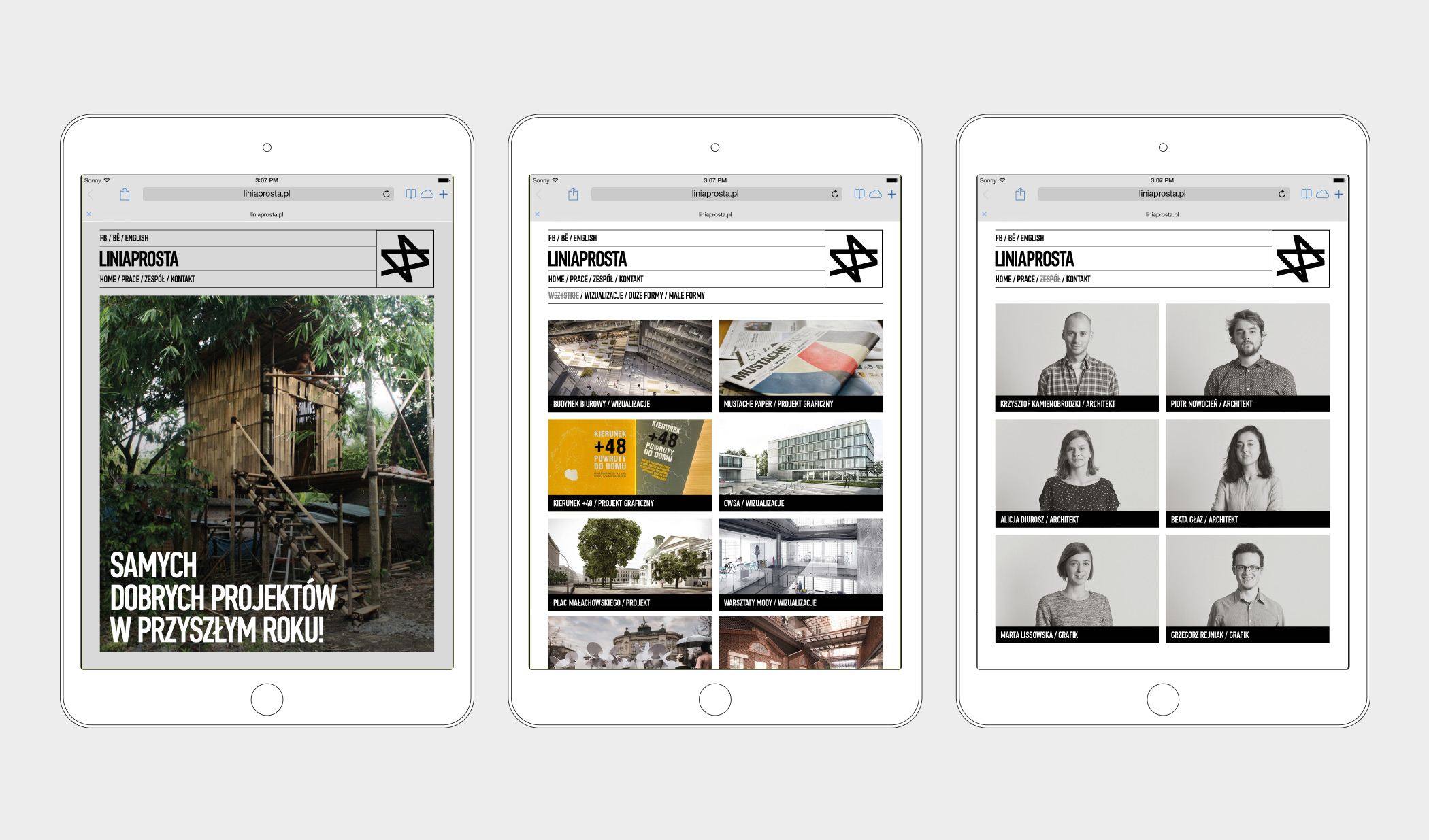
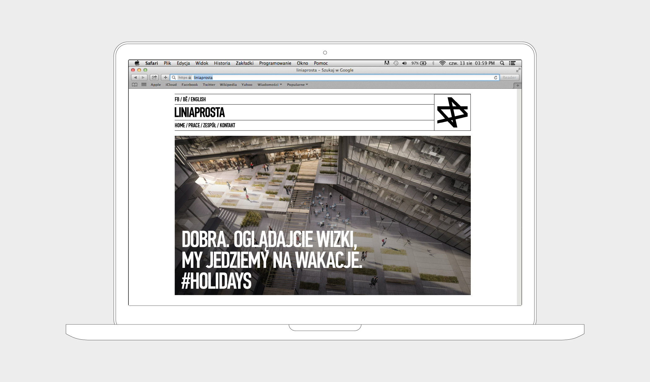
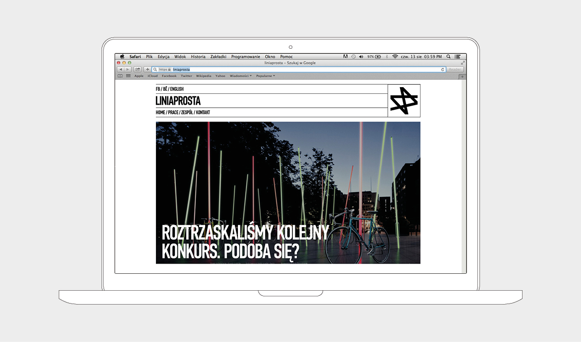
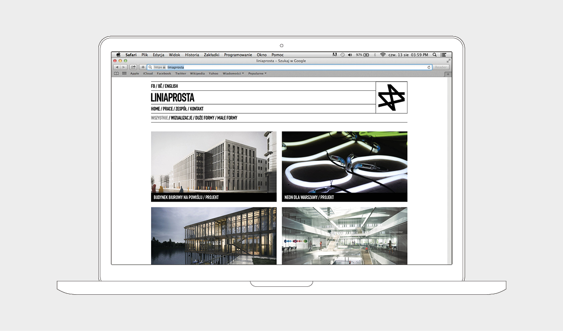
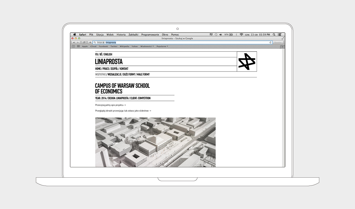
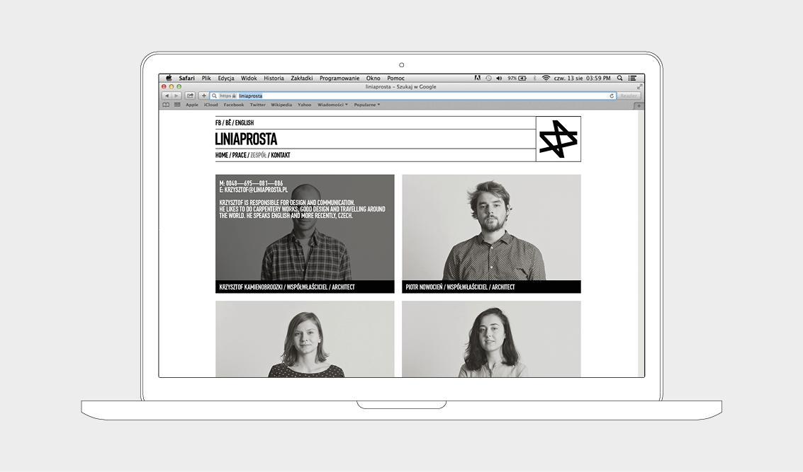
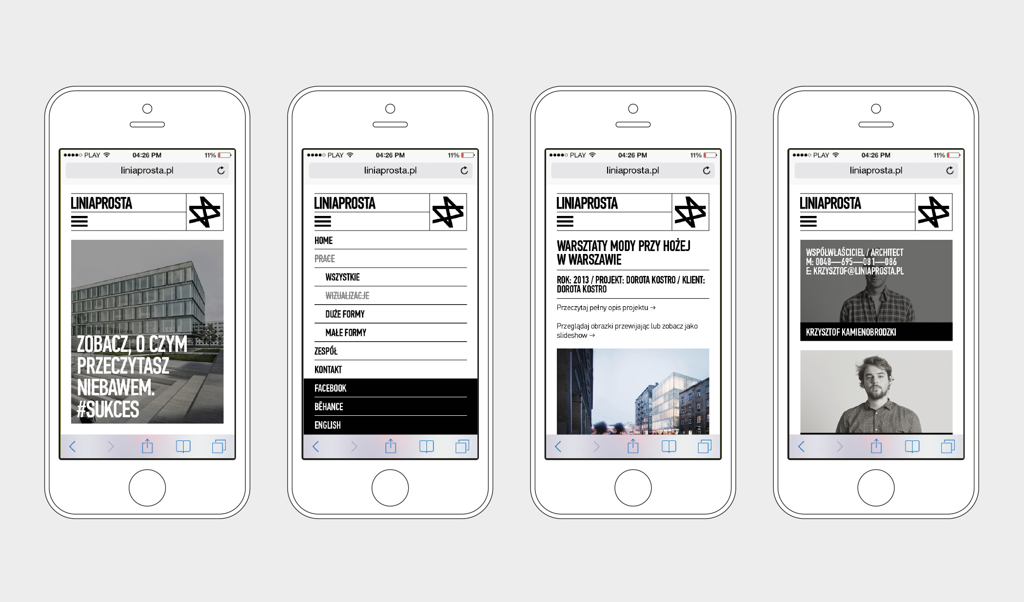
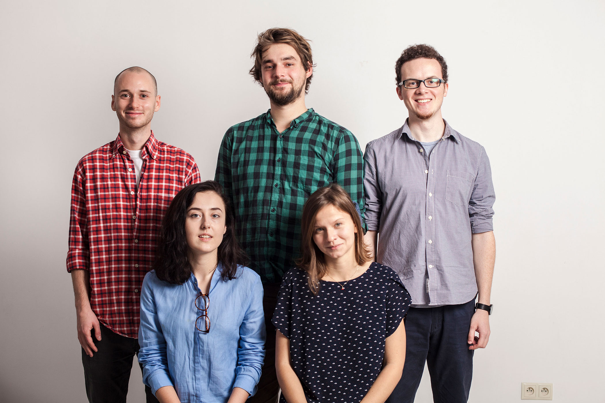
Guys from Liniaprosta asked us to slightly redesign their logo and put everything in right order. So we designed the no-logo system, papers, cards, website and made photos of the team members.
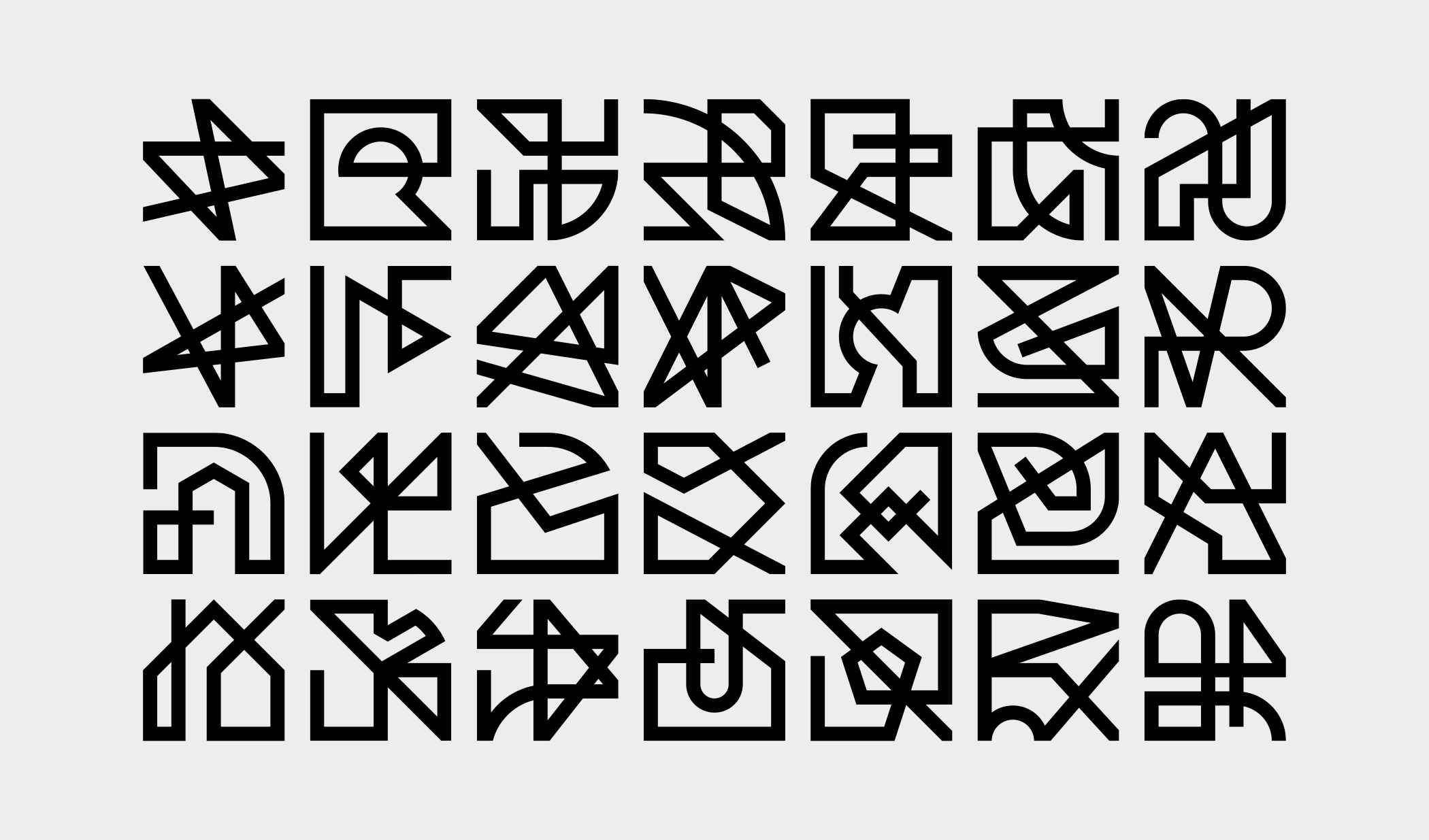
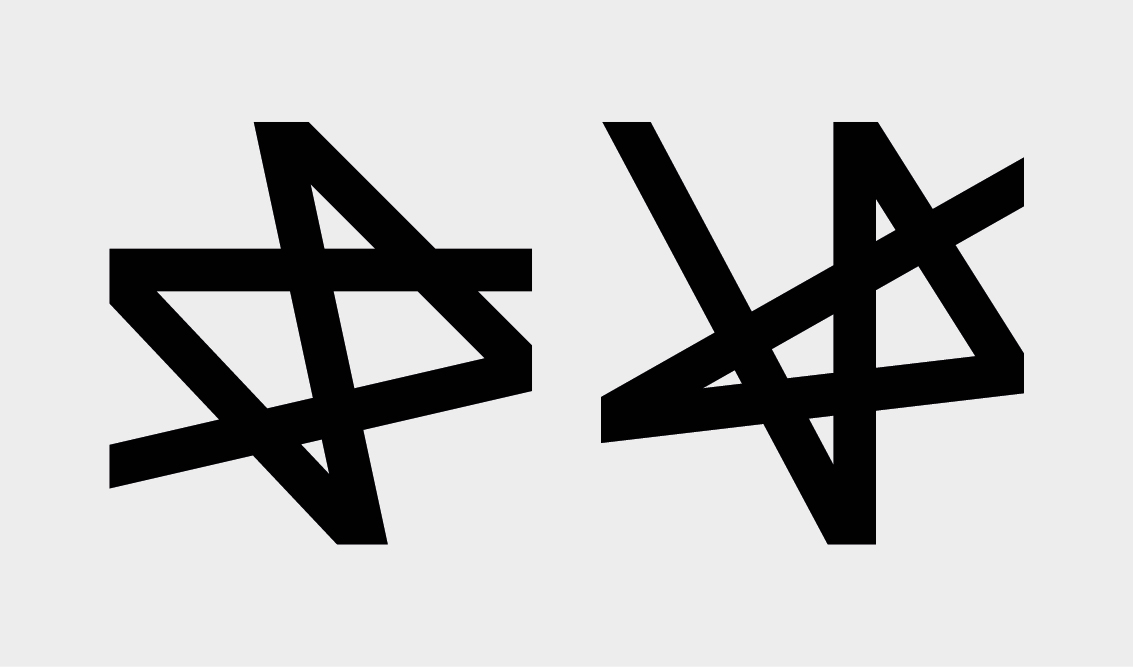
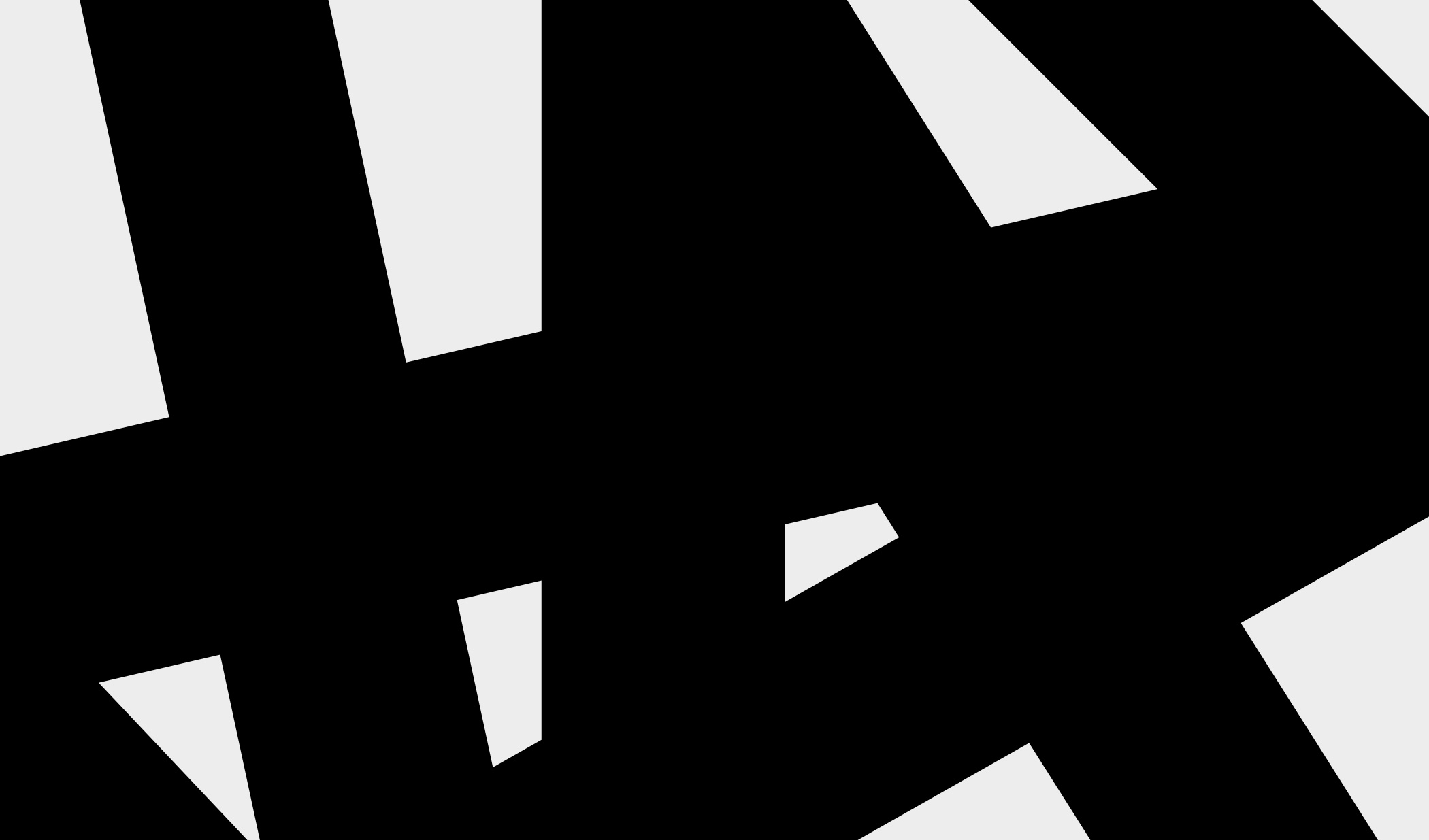
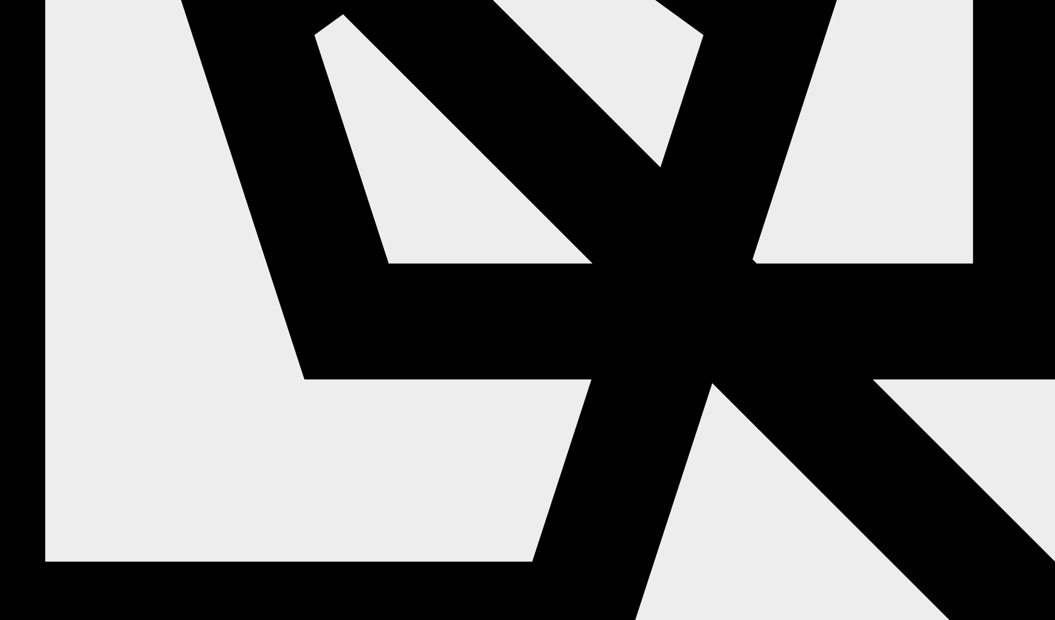
No-logo system came from Liniaprosta owners original idea: to draw a logo in 7 seconds. How could we not enjoy to expand it? We drew the simple grid. Than, two polilines ('linia prosta' in polish means 'straight line') that went to cards, papers and social medias. And several others, that went to their website to appear randomly.
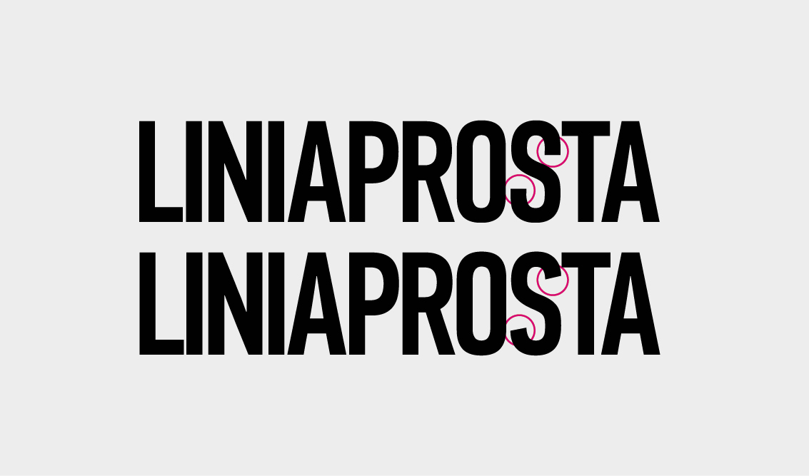
For the text part of the logo, PF DIN Condensed was chosen (with several slightly modified glyphs), cause client had been using it before, for some years.
It's not the logo manifest or something. It's just the open system – everybody can draw this logo (OK, you should have this simple 10 x 10 grid).
THX: Ewa Dyszlewicz
