Baukustik
Identity for a building acoustics company.
Client: Baukustik
2023–
Project info +
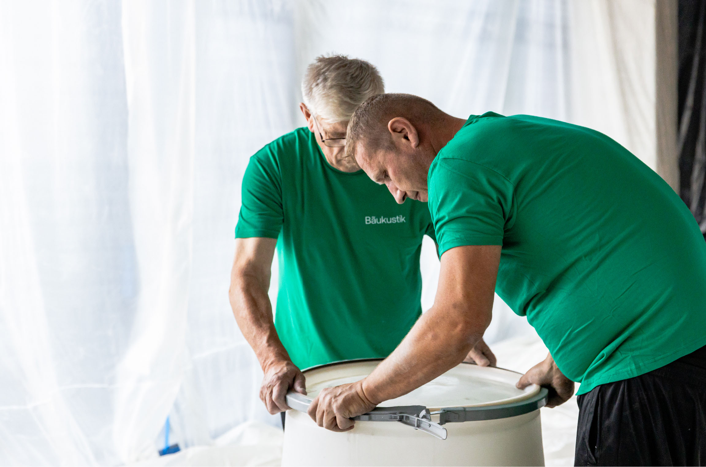
In collaboration with Piotr Pupczyk (web development) and Piotrek Darecki (company photo).
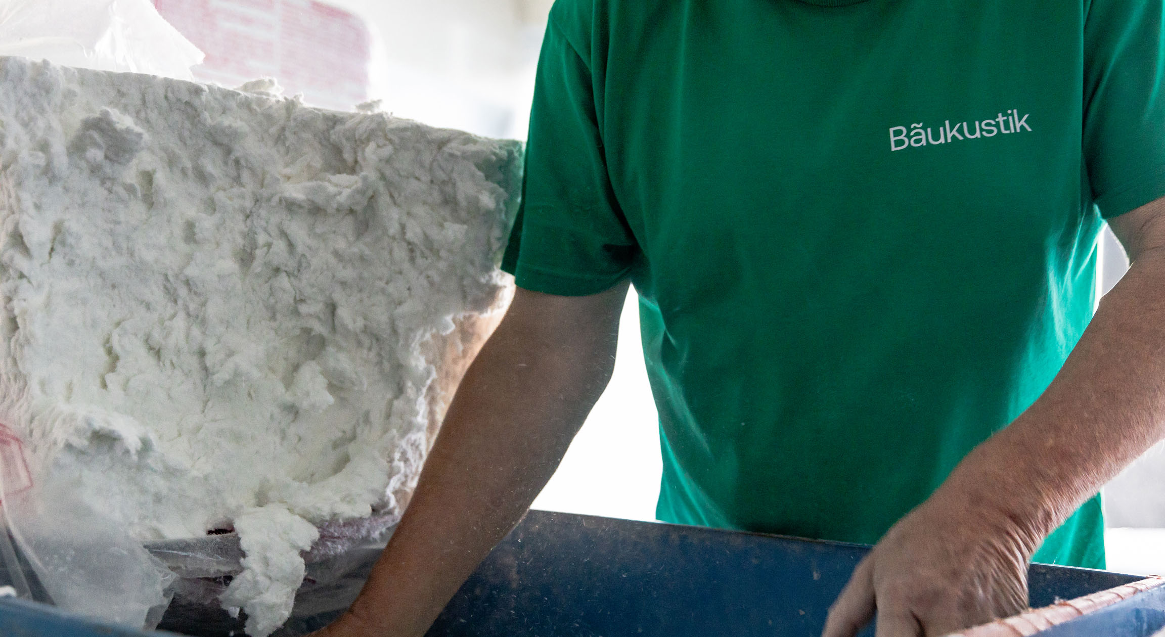
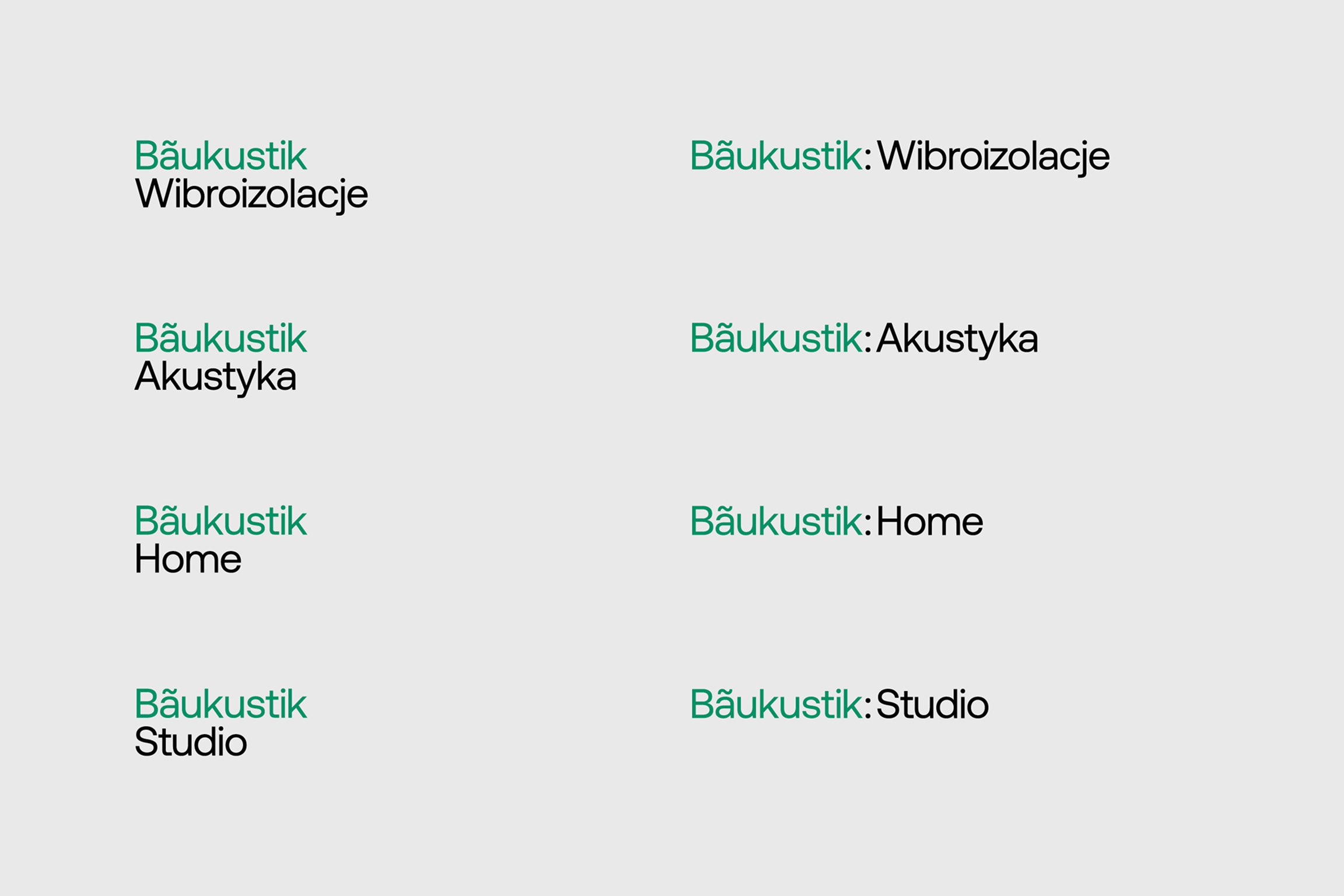
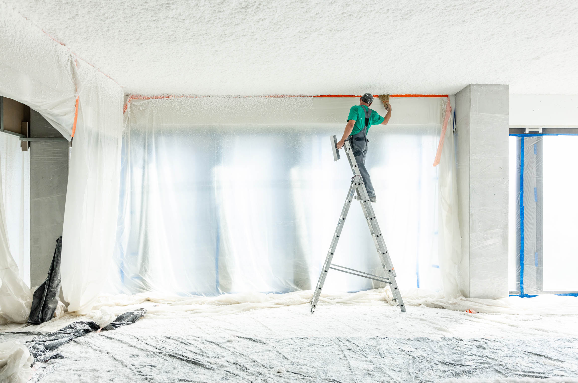
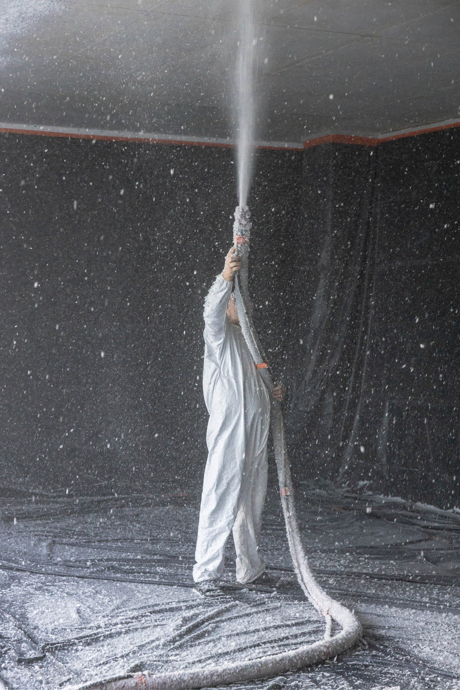
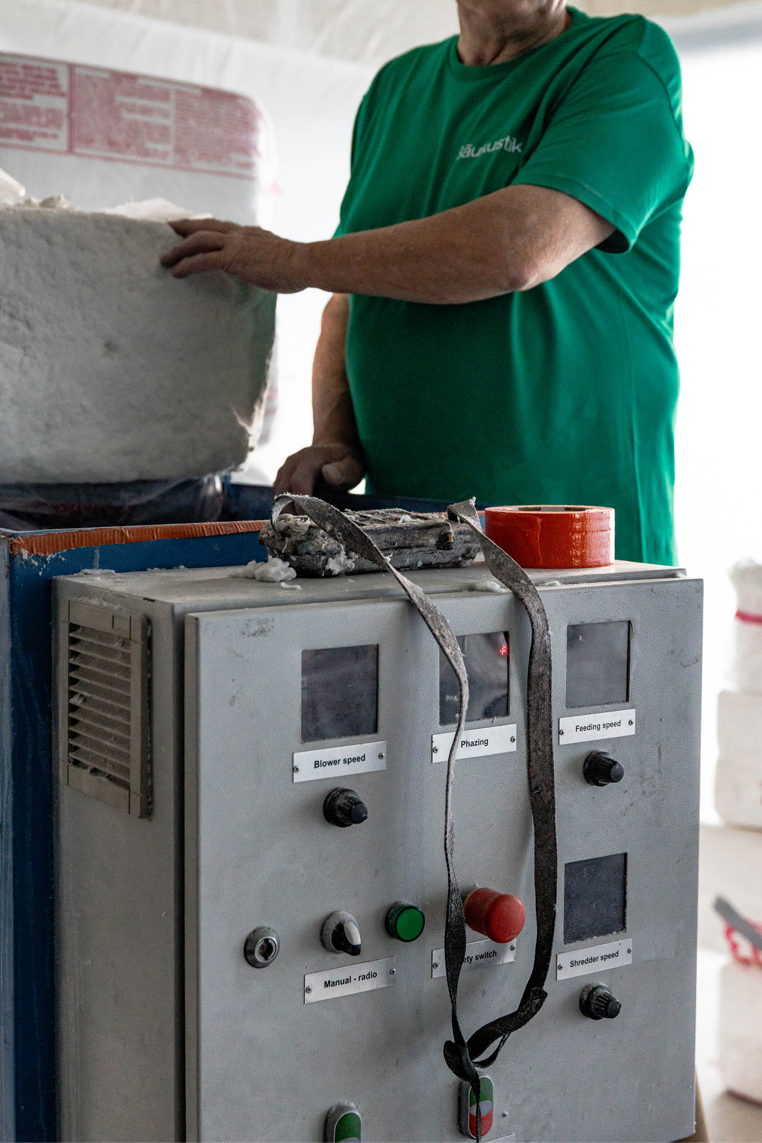
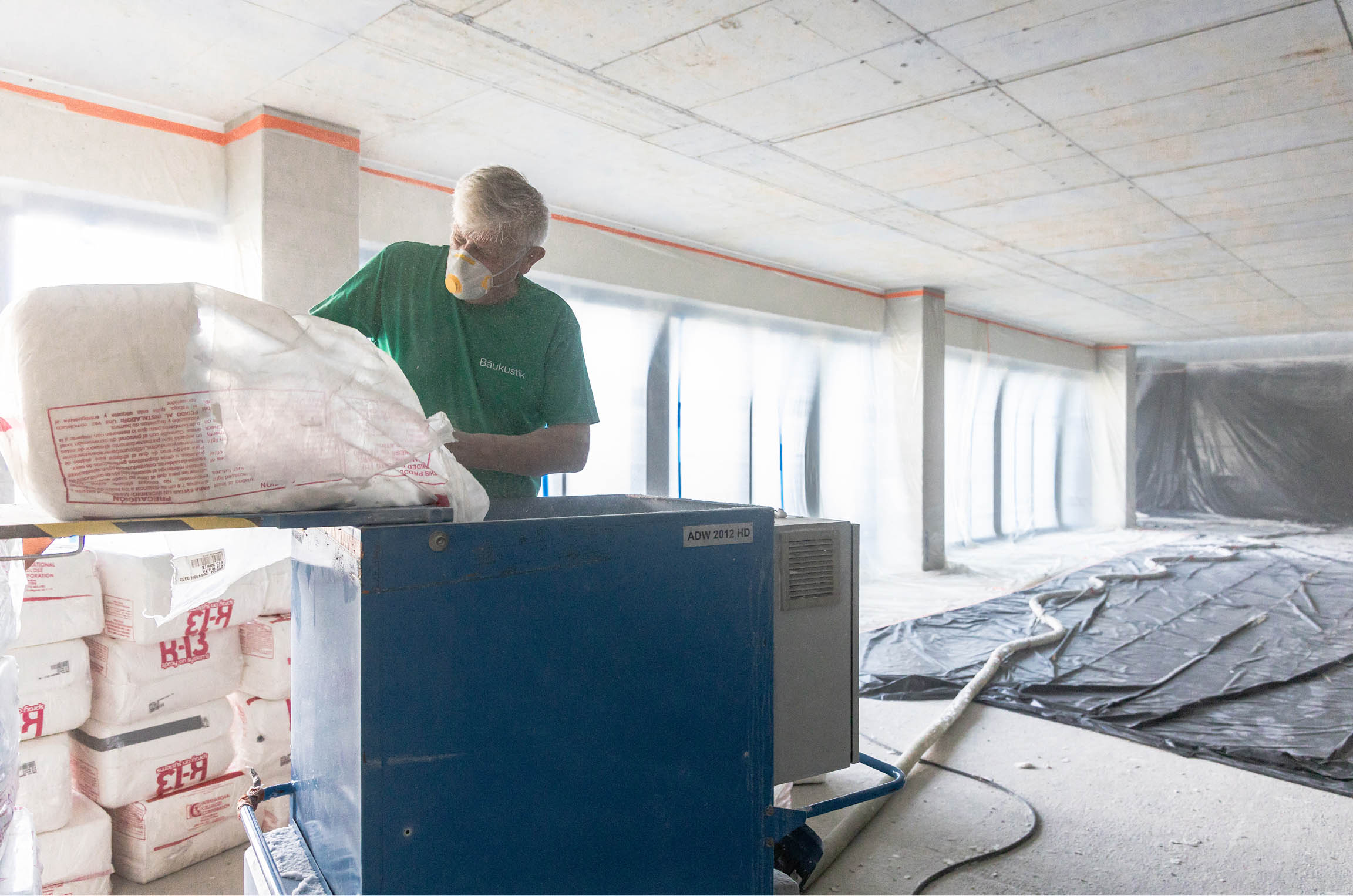
Baukustik is a company specializing in building acoustics and vibration isolation. They know how to make buildings and interiors not only look good, but also sound good. If you want to improve the acoustics of a building or isolate it from vibrations, contacting Baukustik is the best idea.
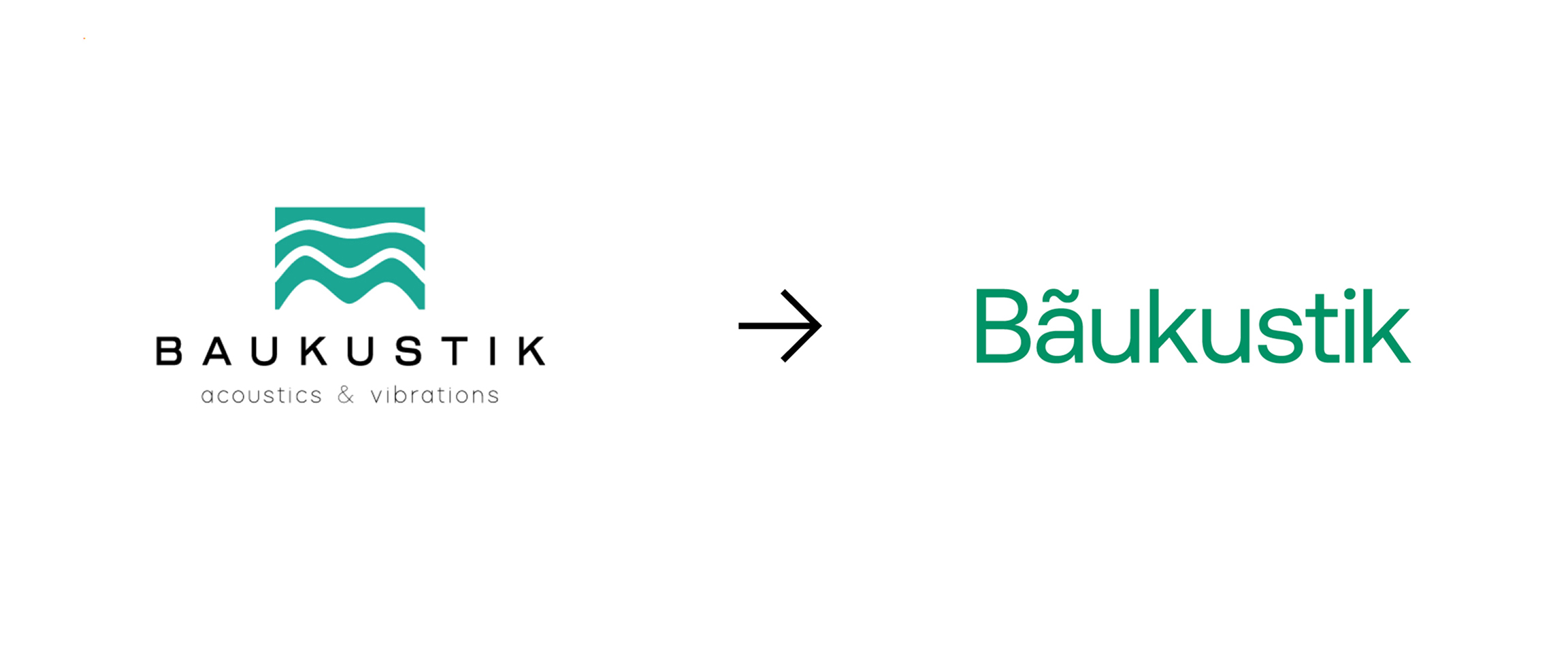
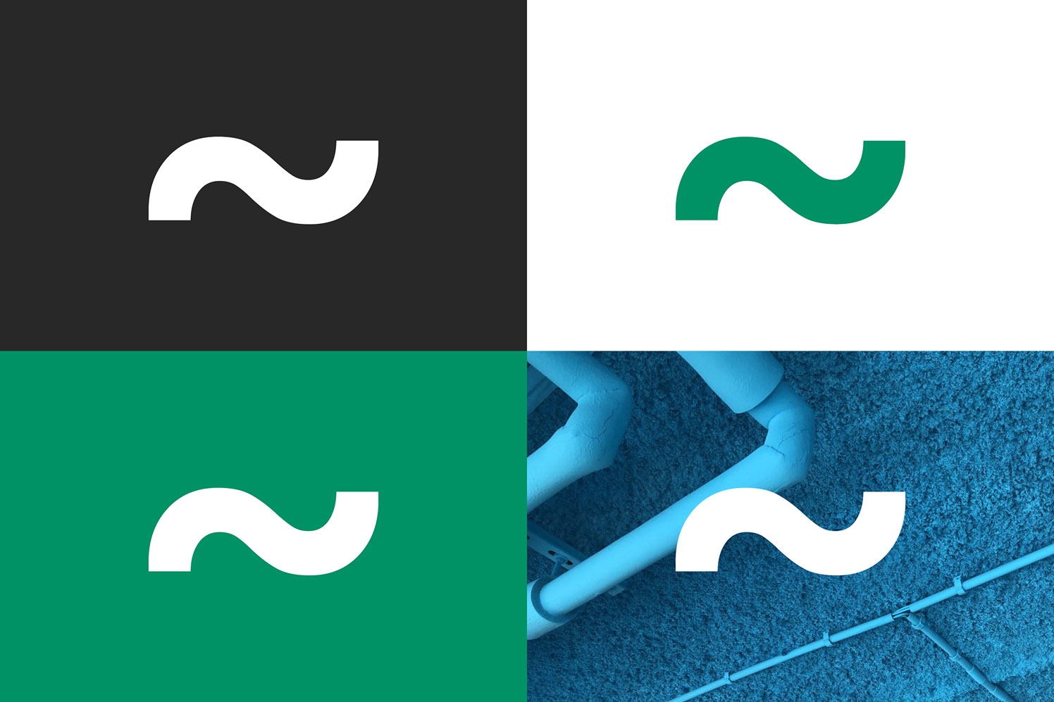
The company already had a logo, several implemented formats and a great name. From the formats, I retained the communication style and simplified color scheme. I created everything else from scratch, keeping in mind the need to build a framework for the extensive branding of the developing brand.
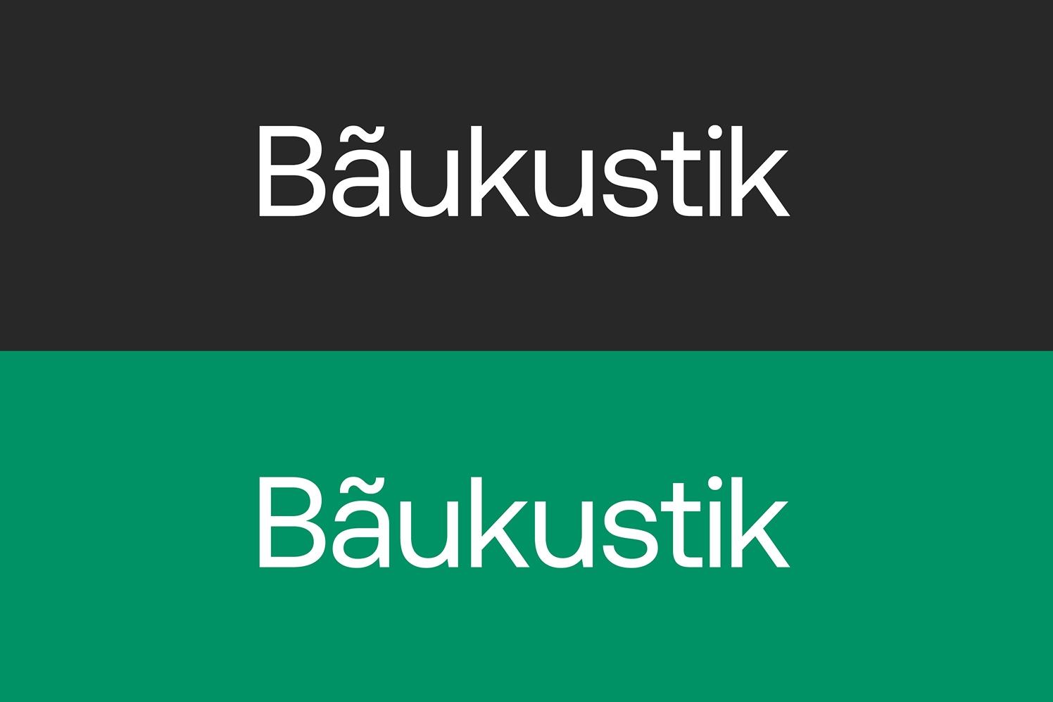
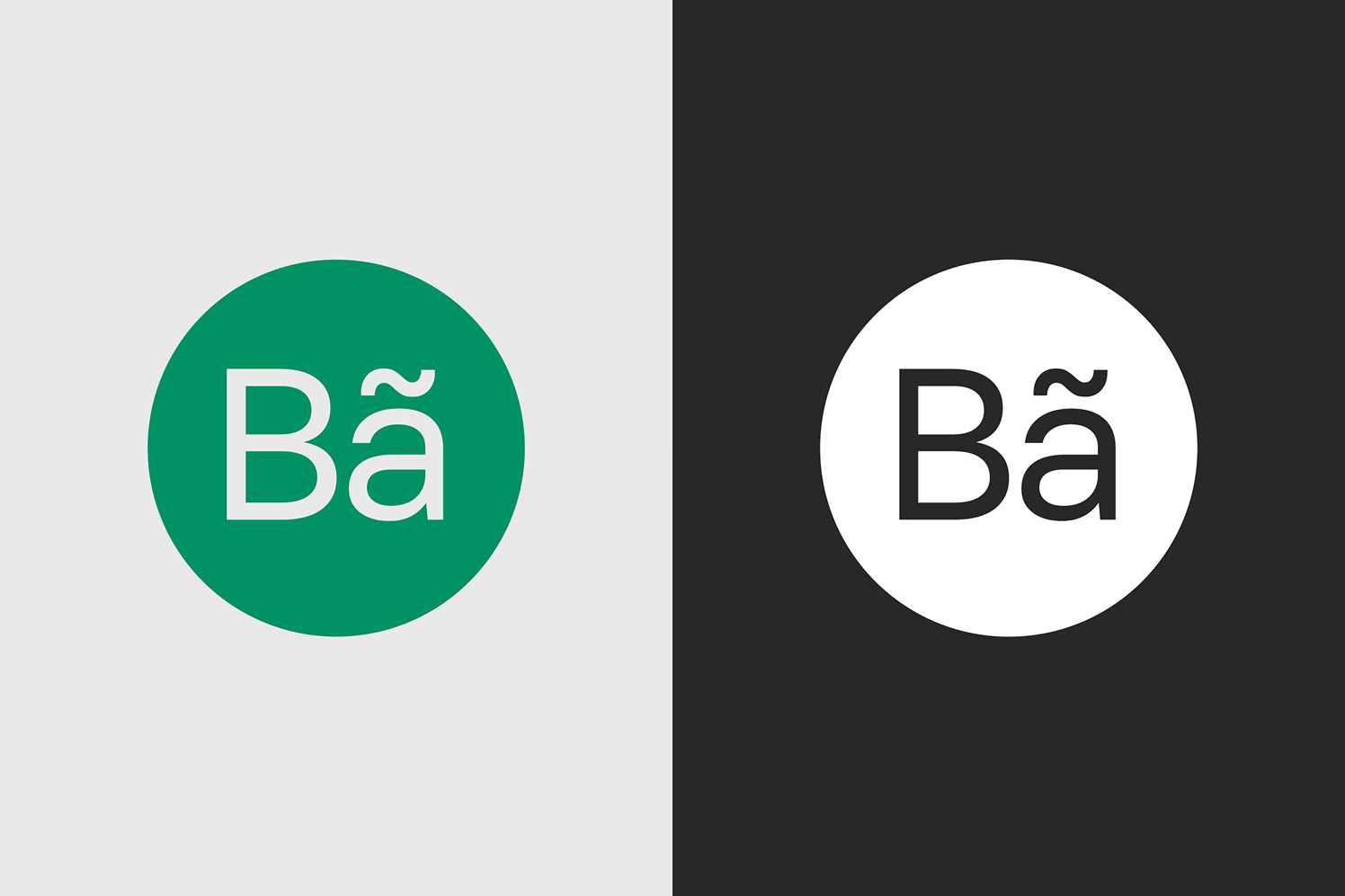
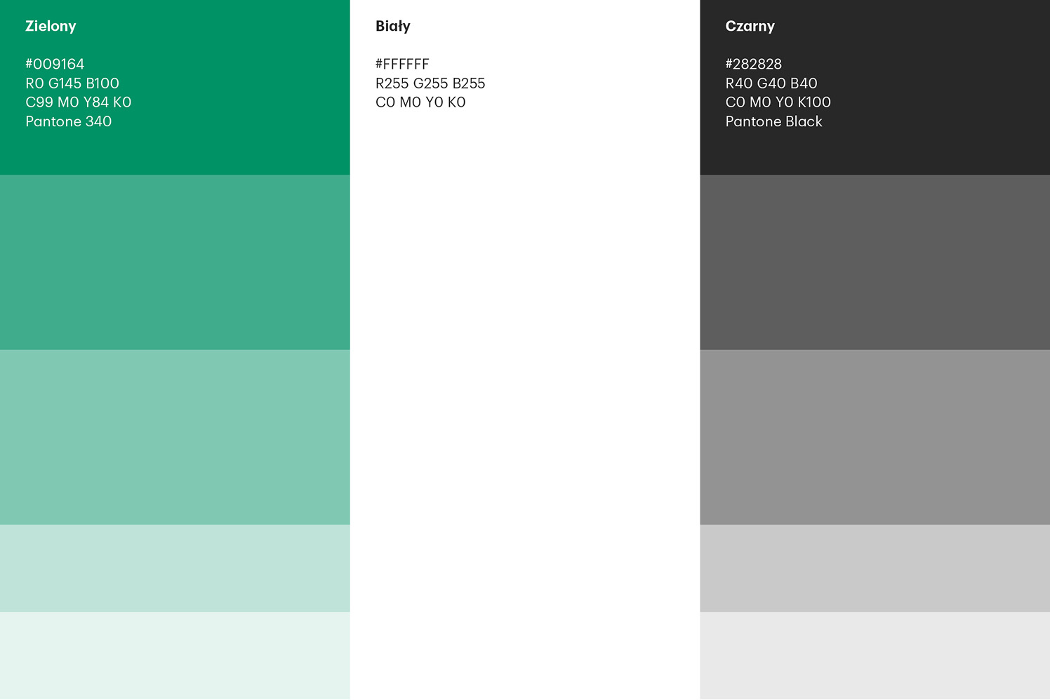
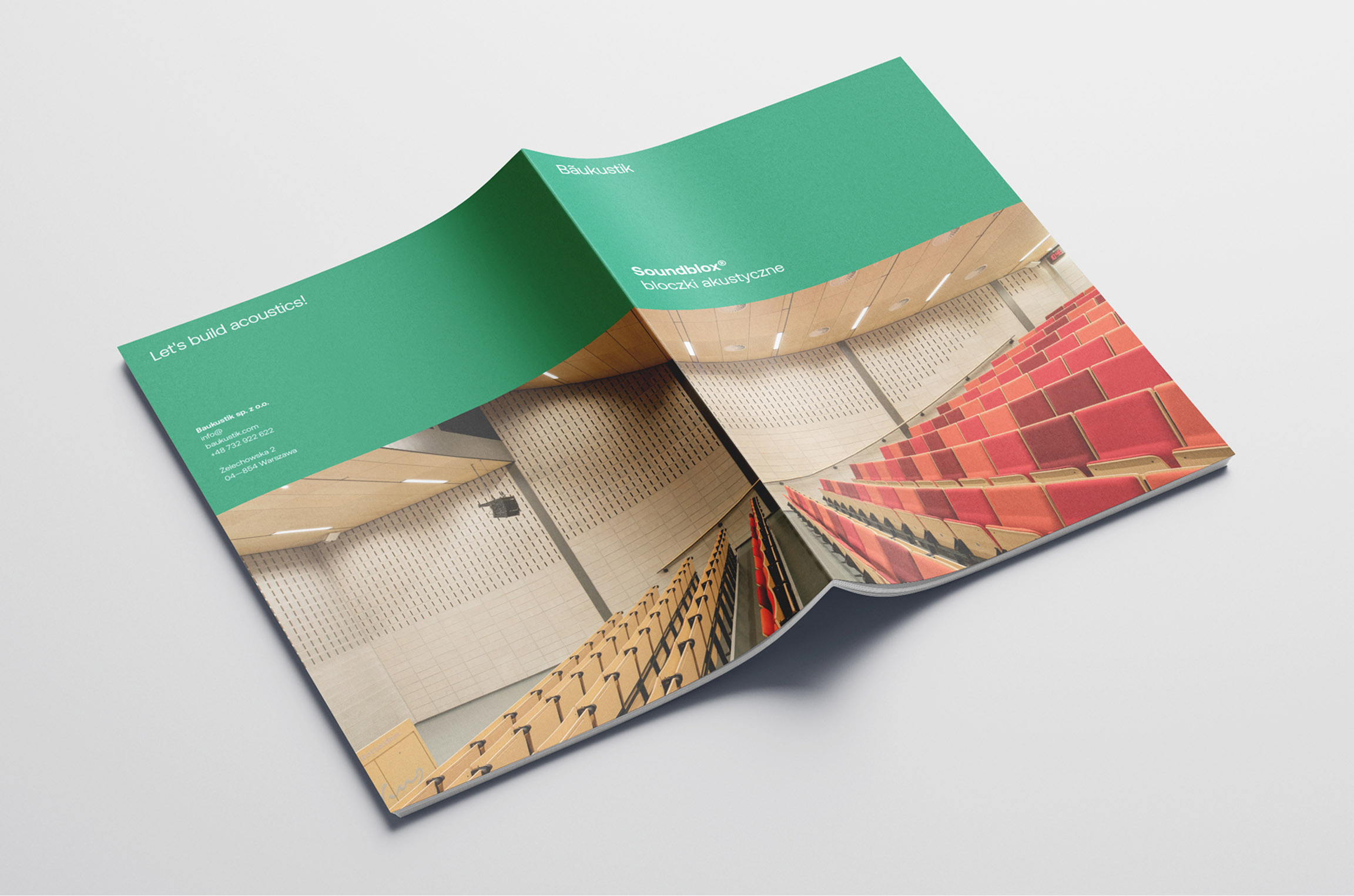
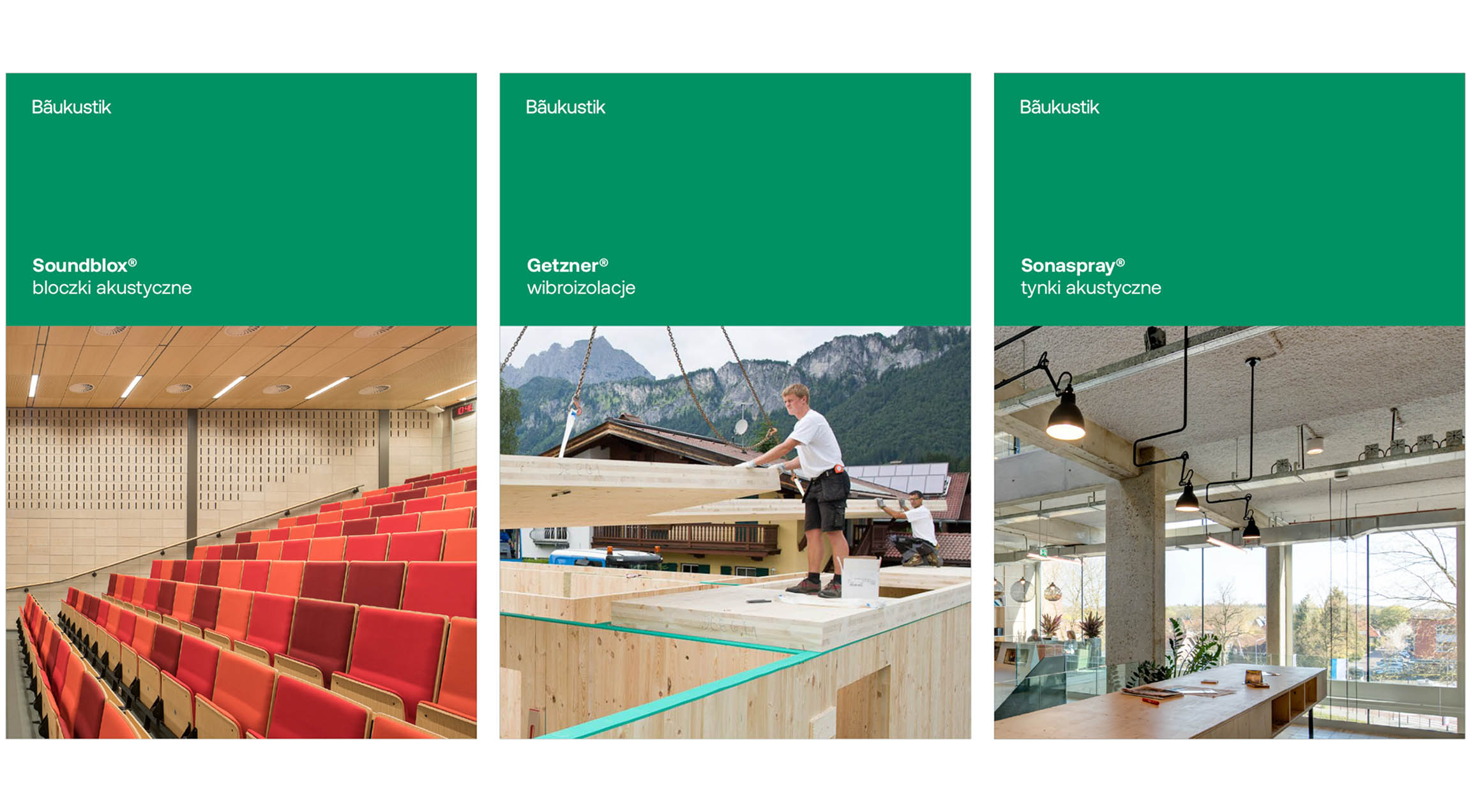
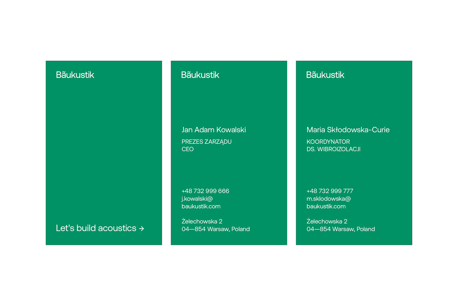
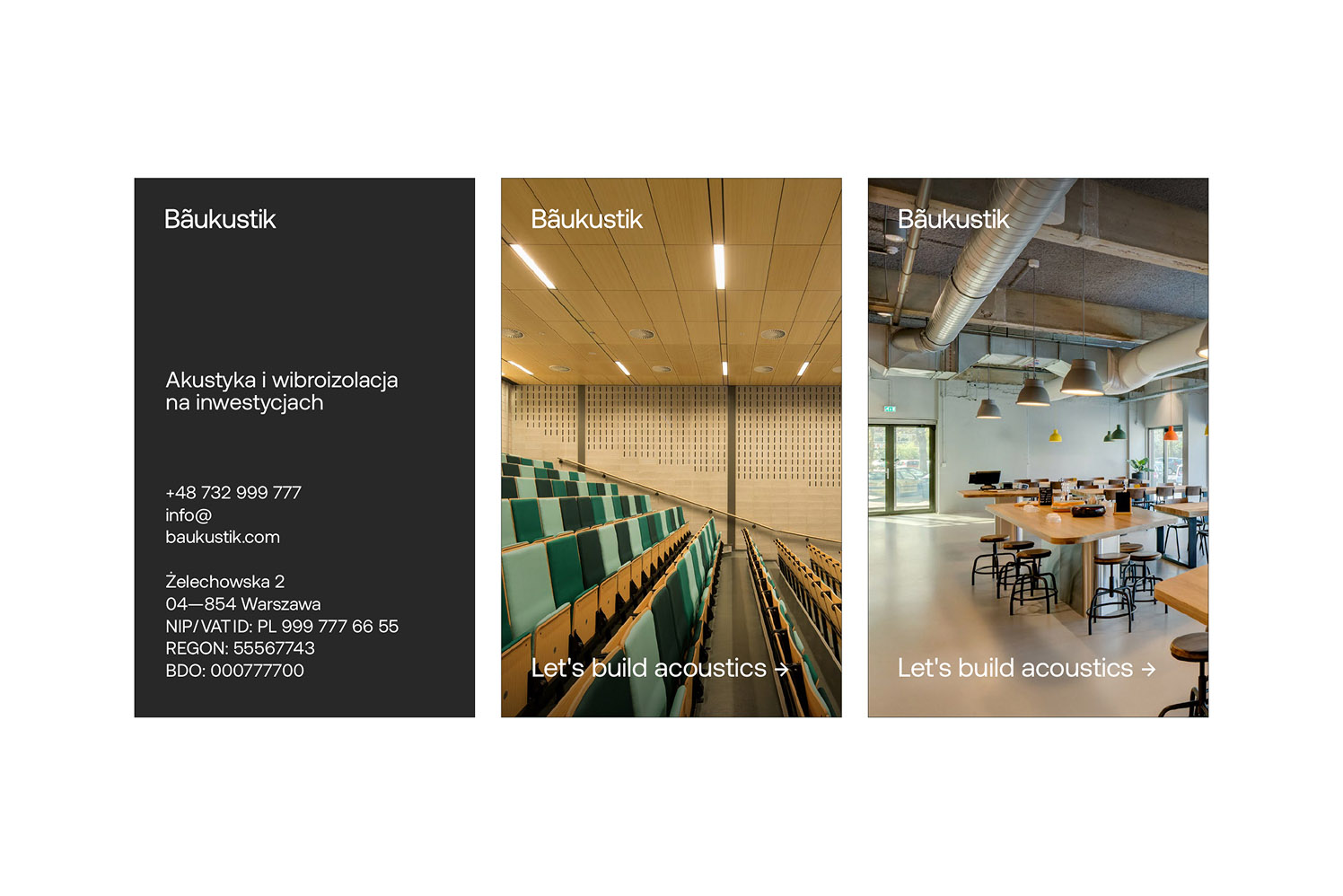
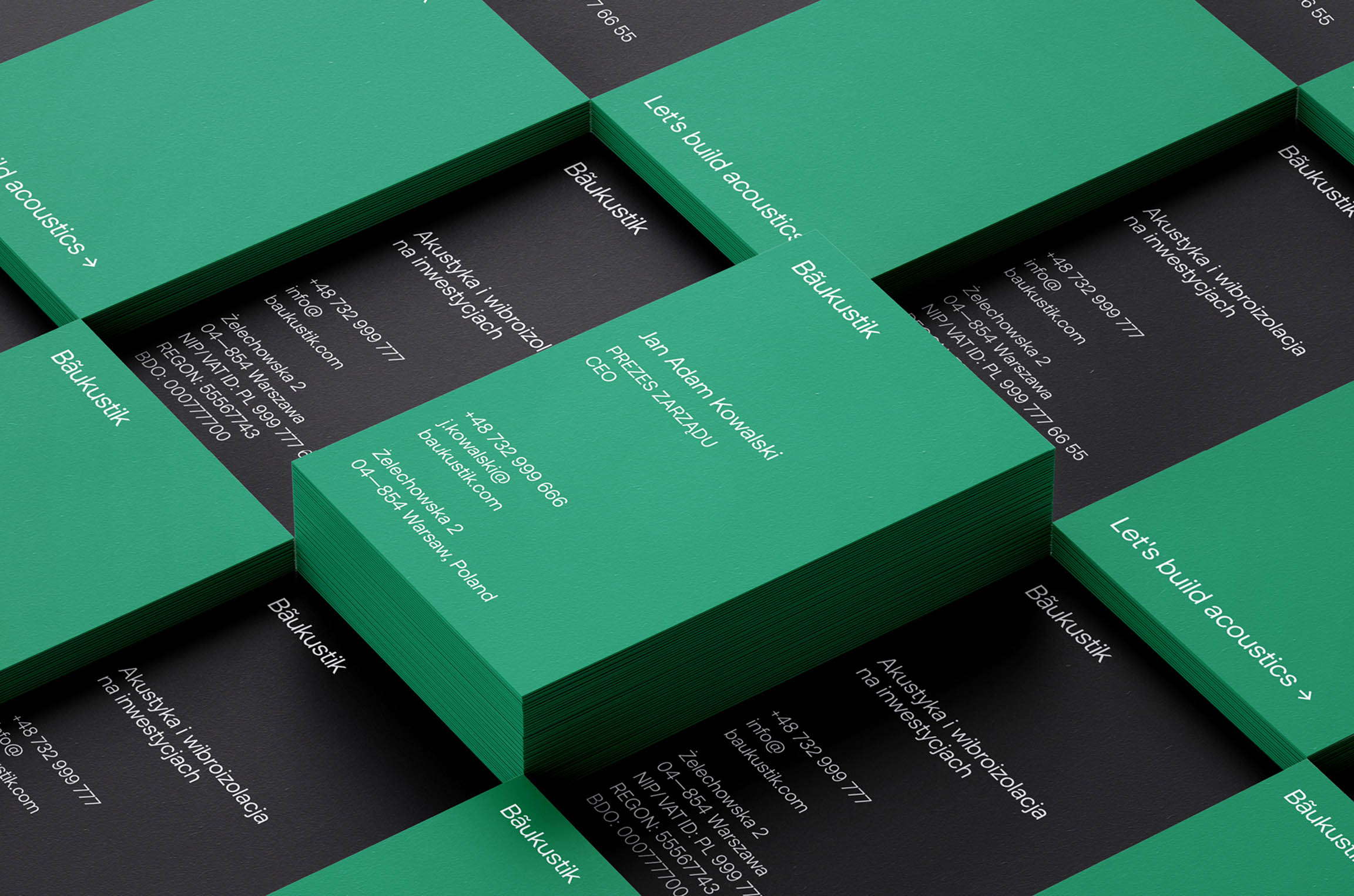
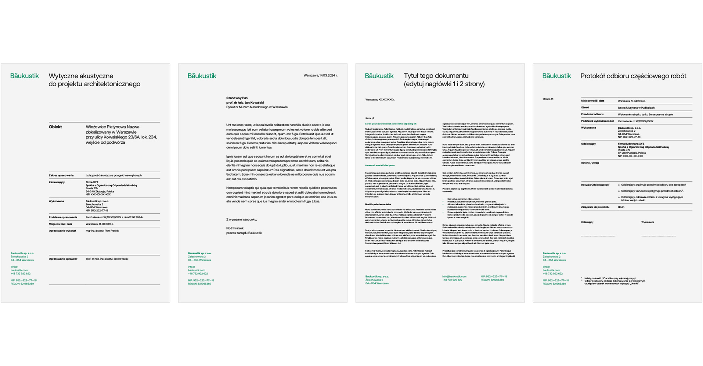
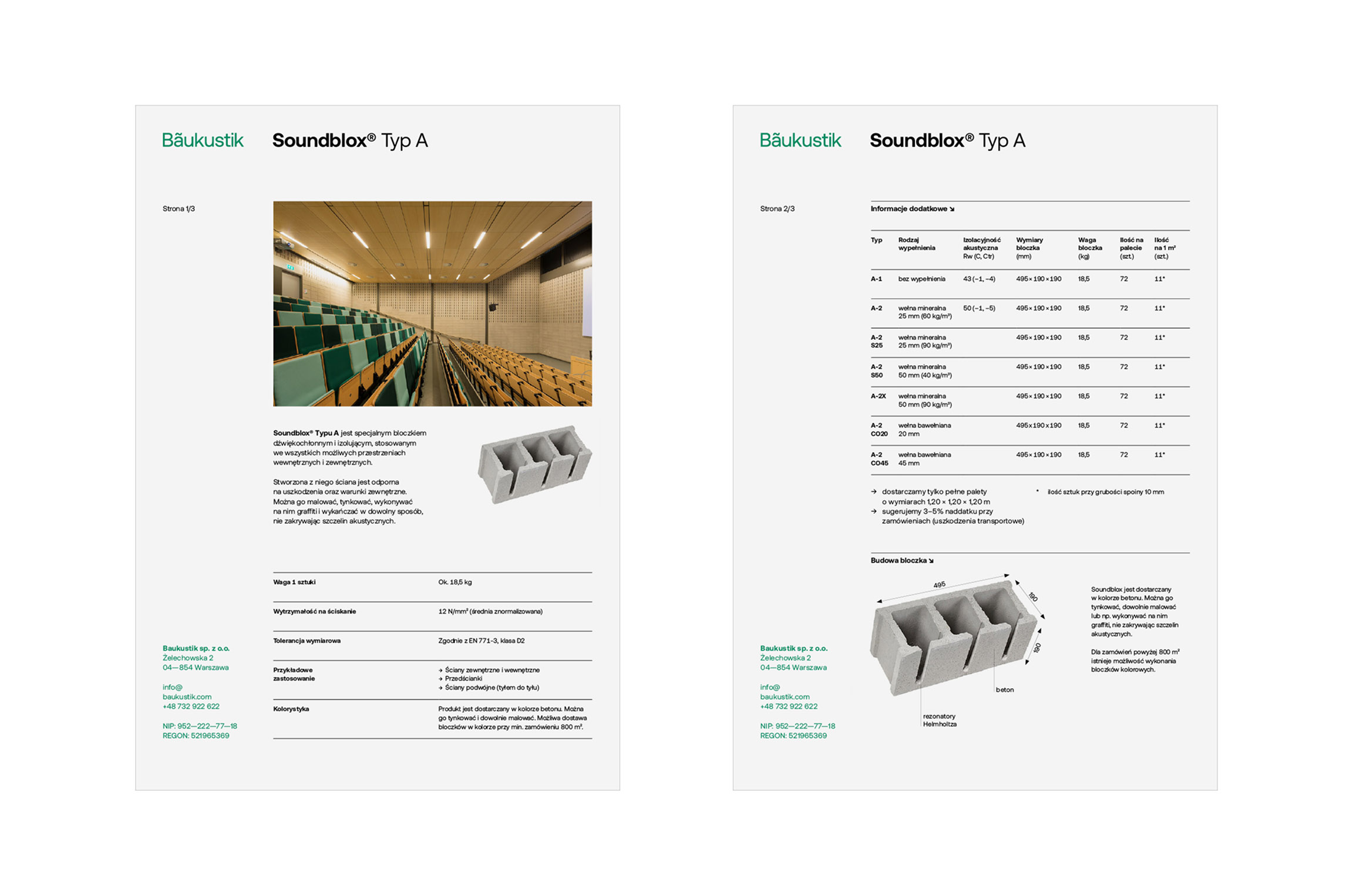
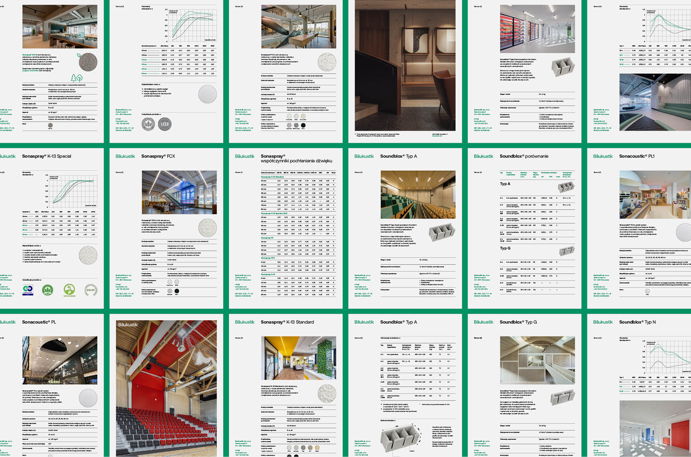
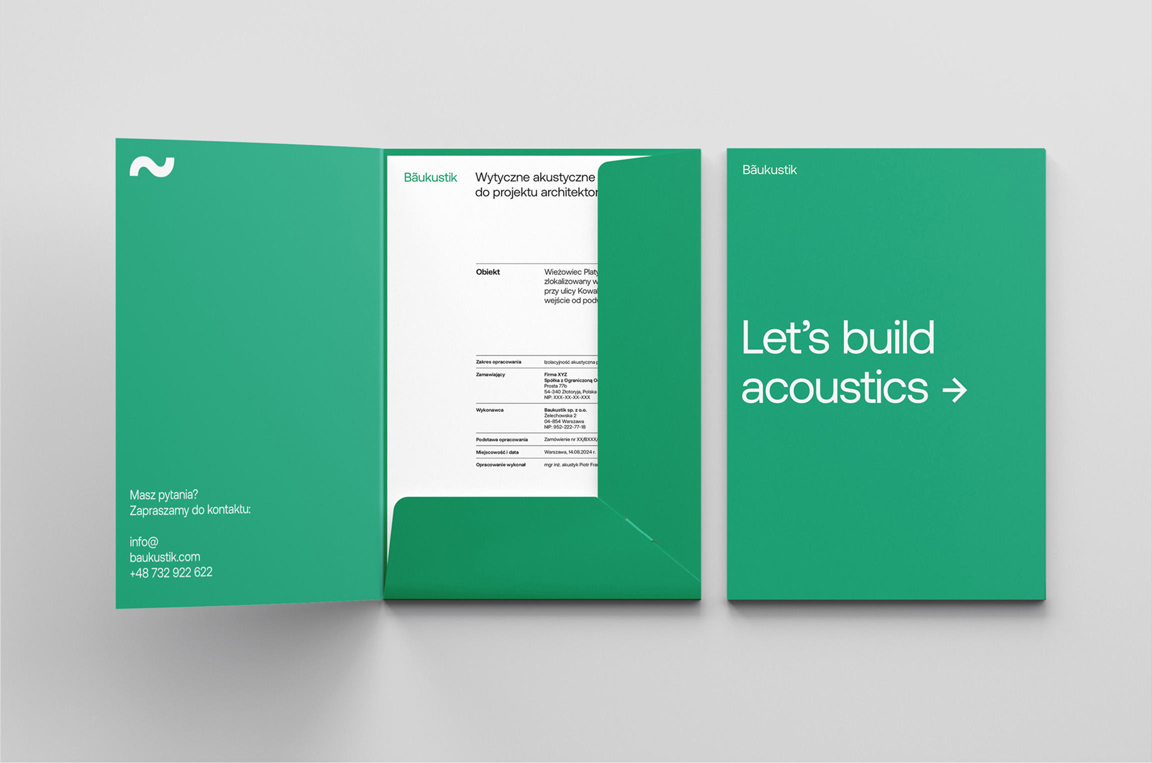
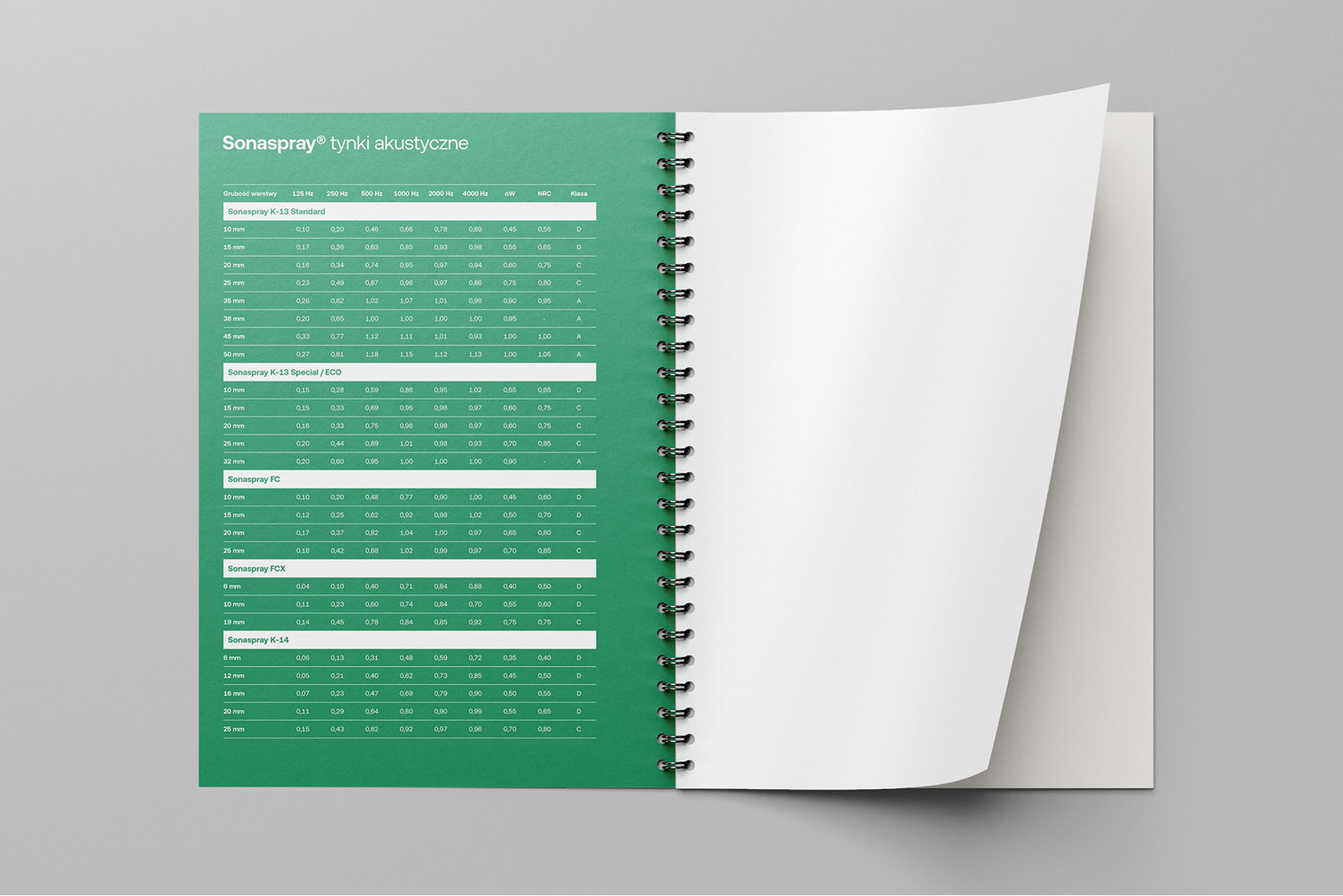
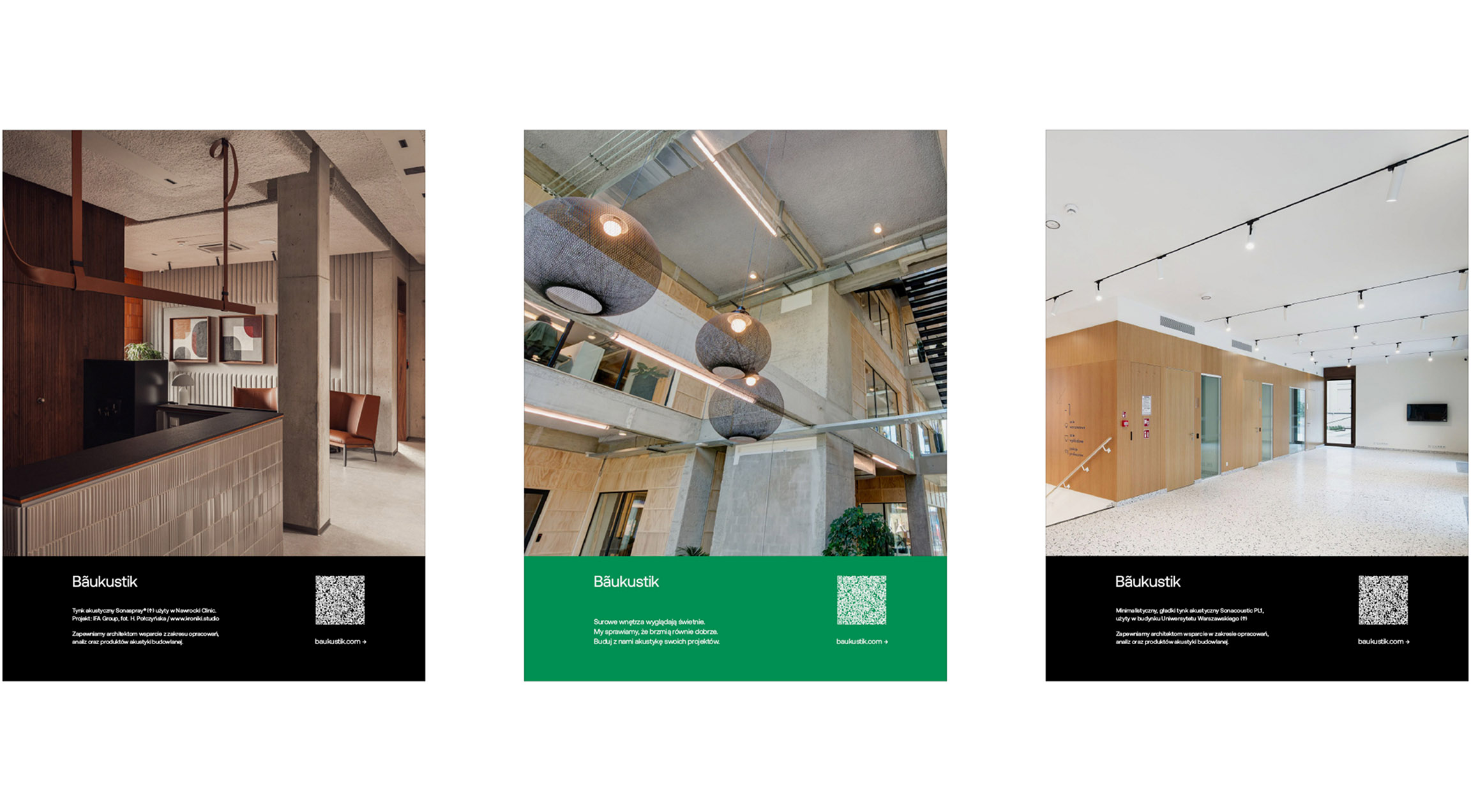
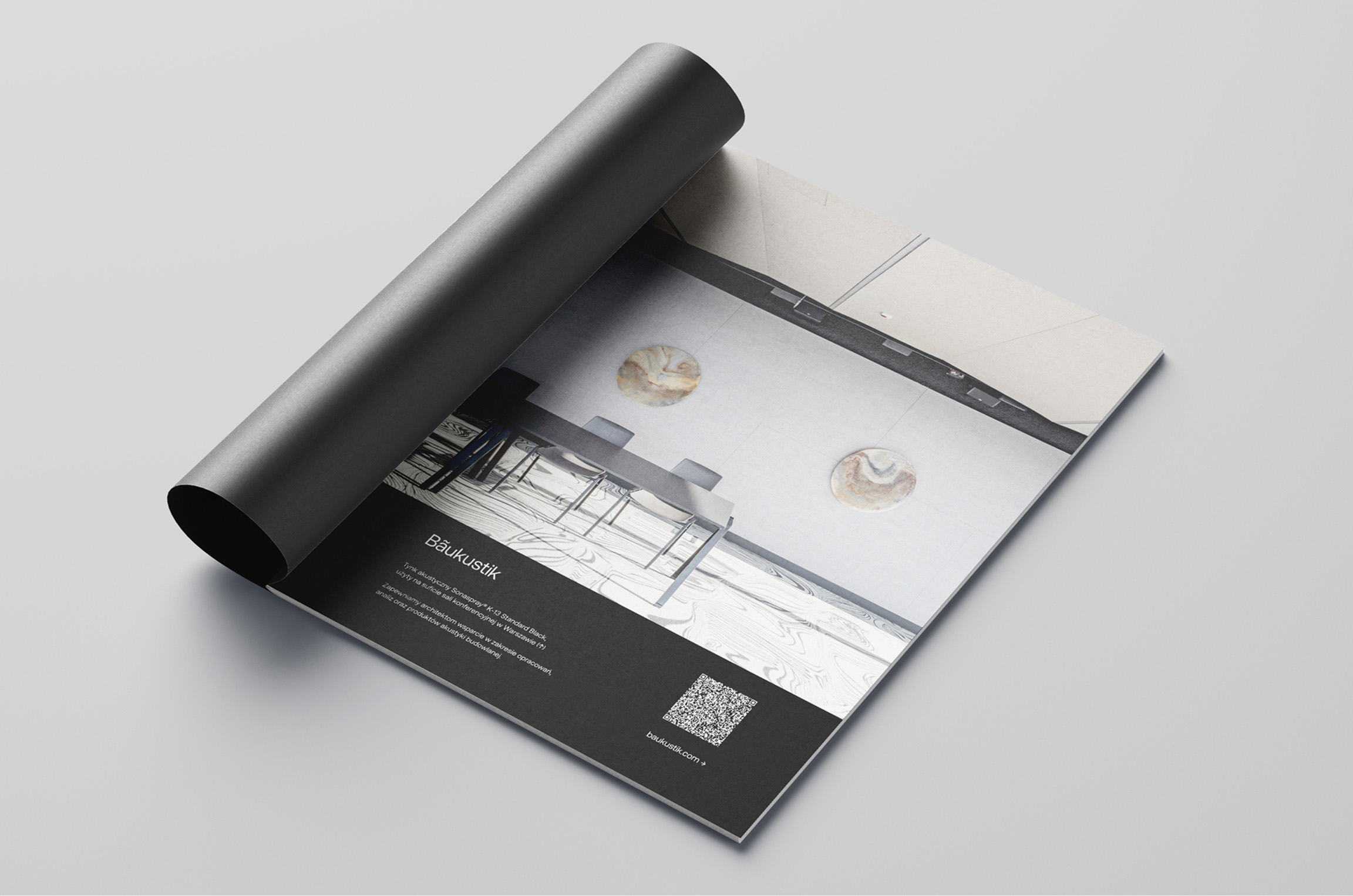
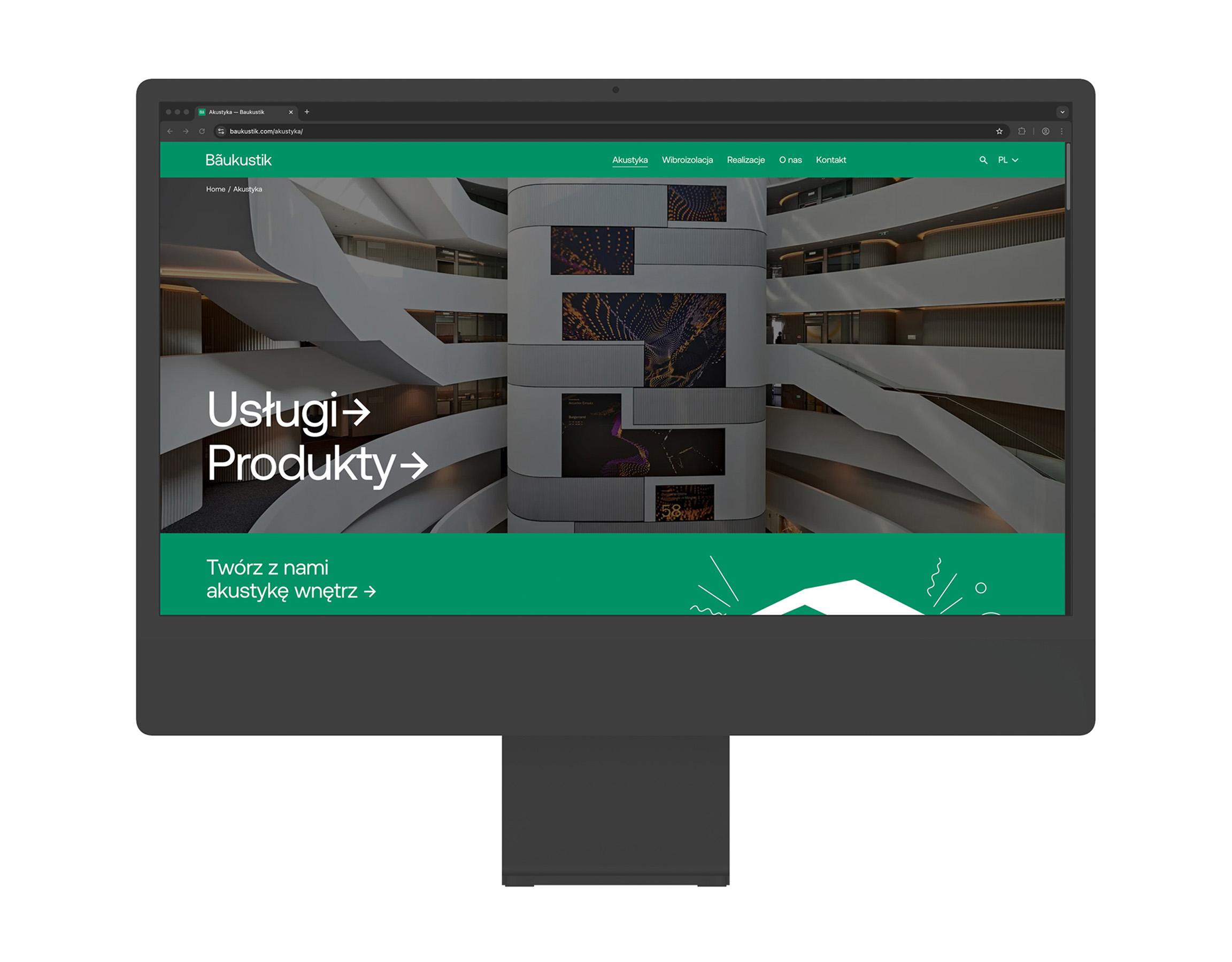
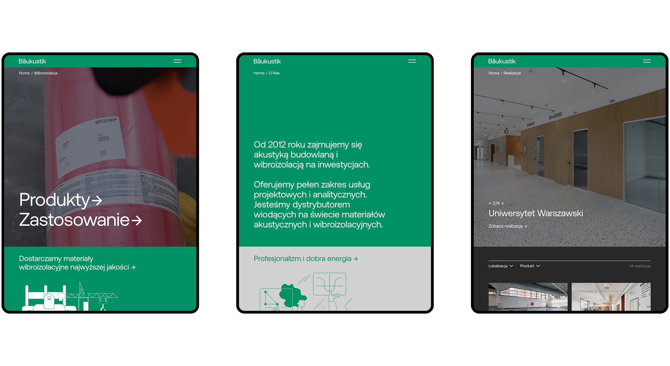
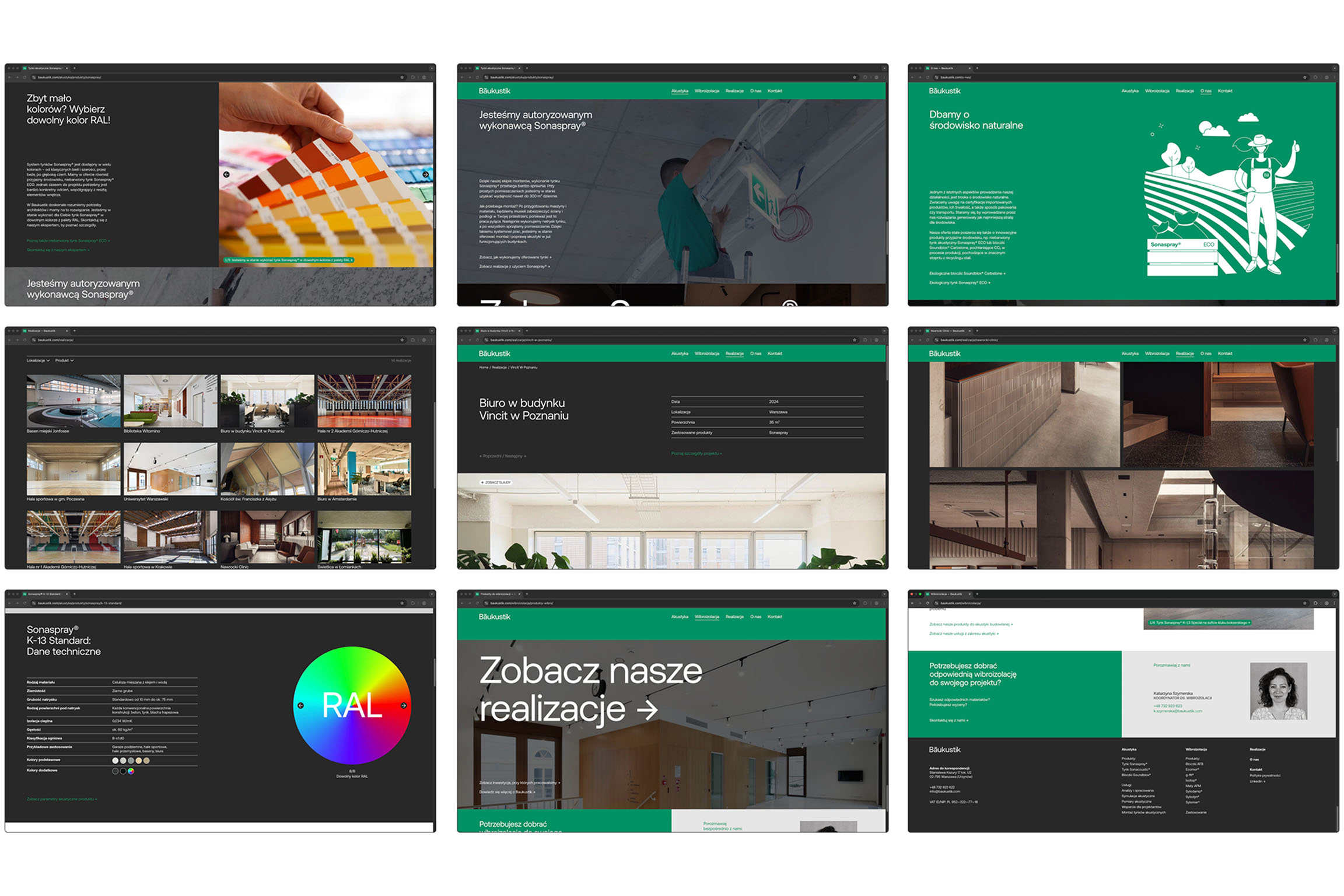
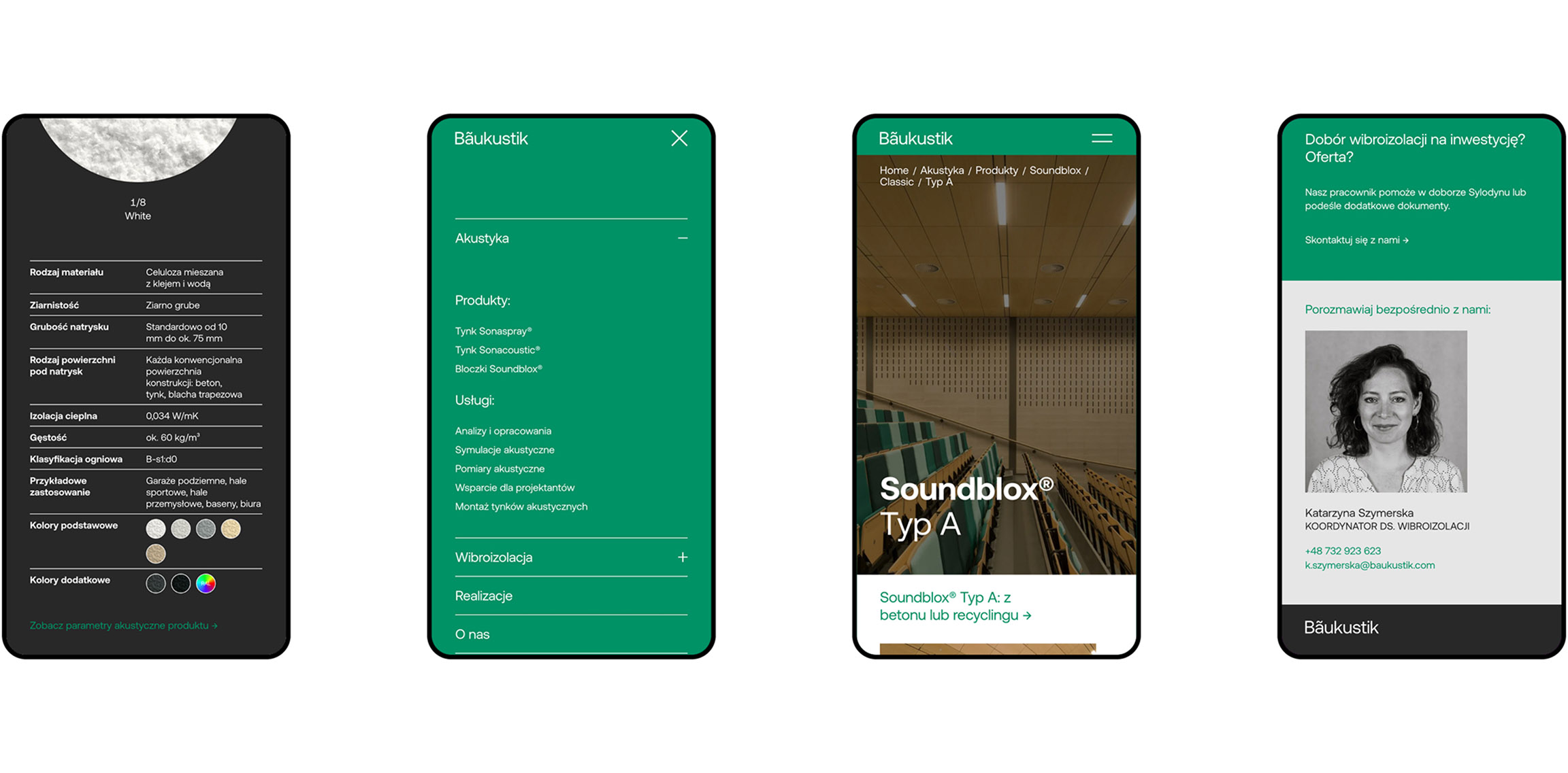
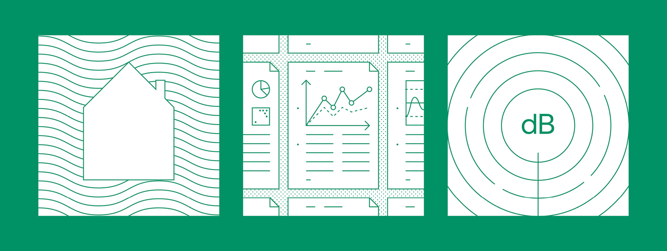
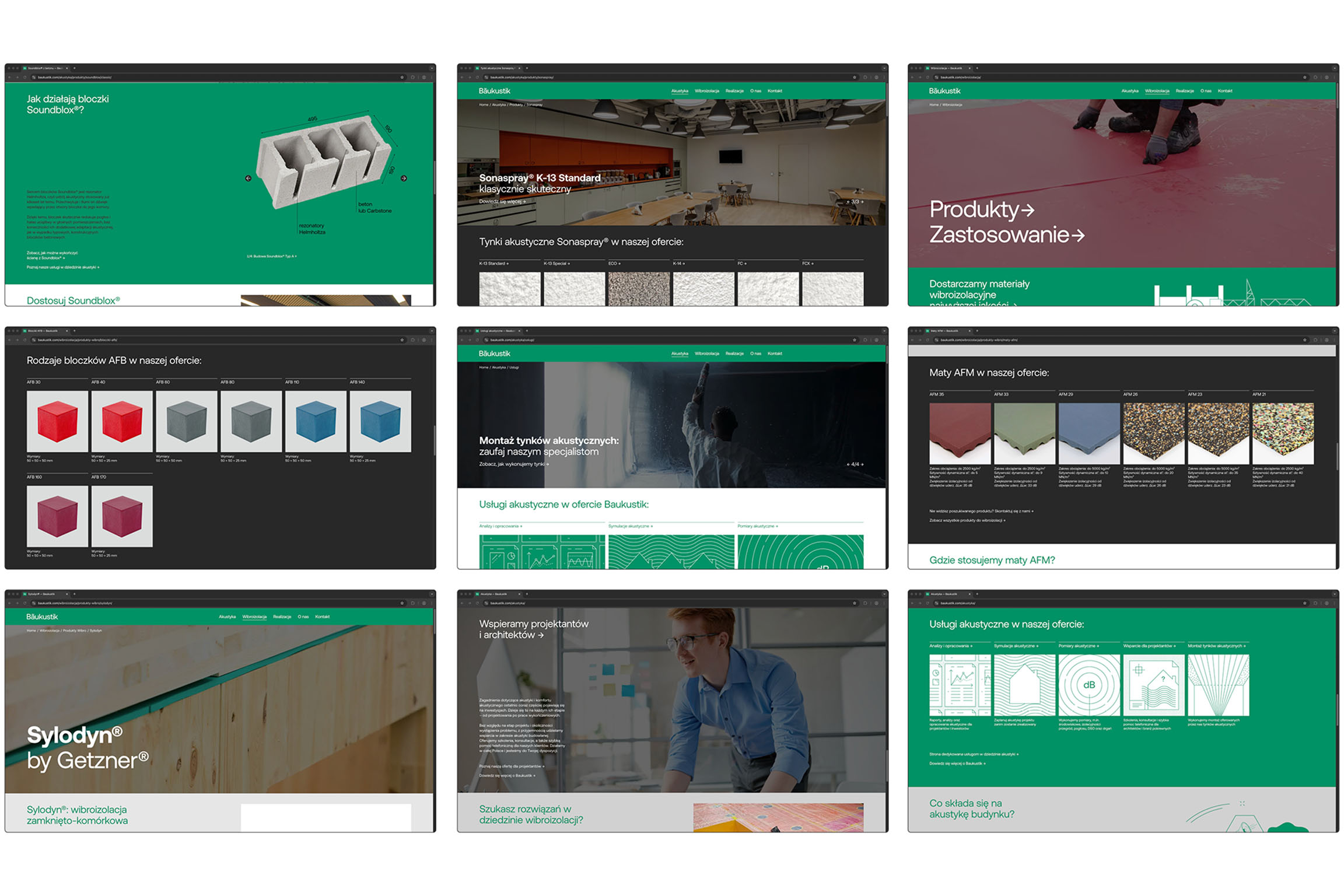
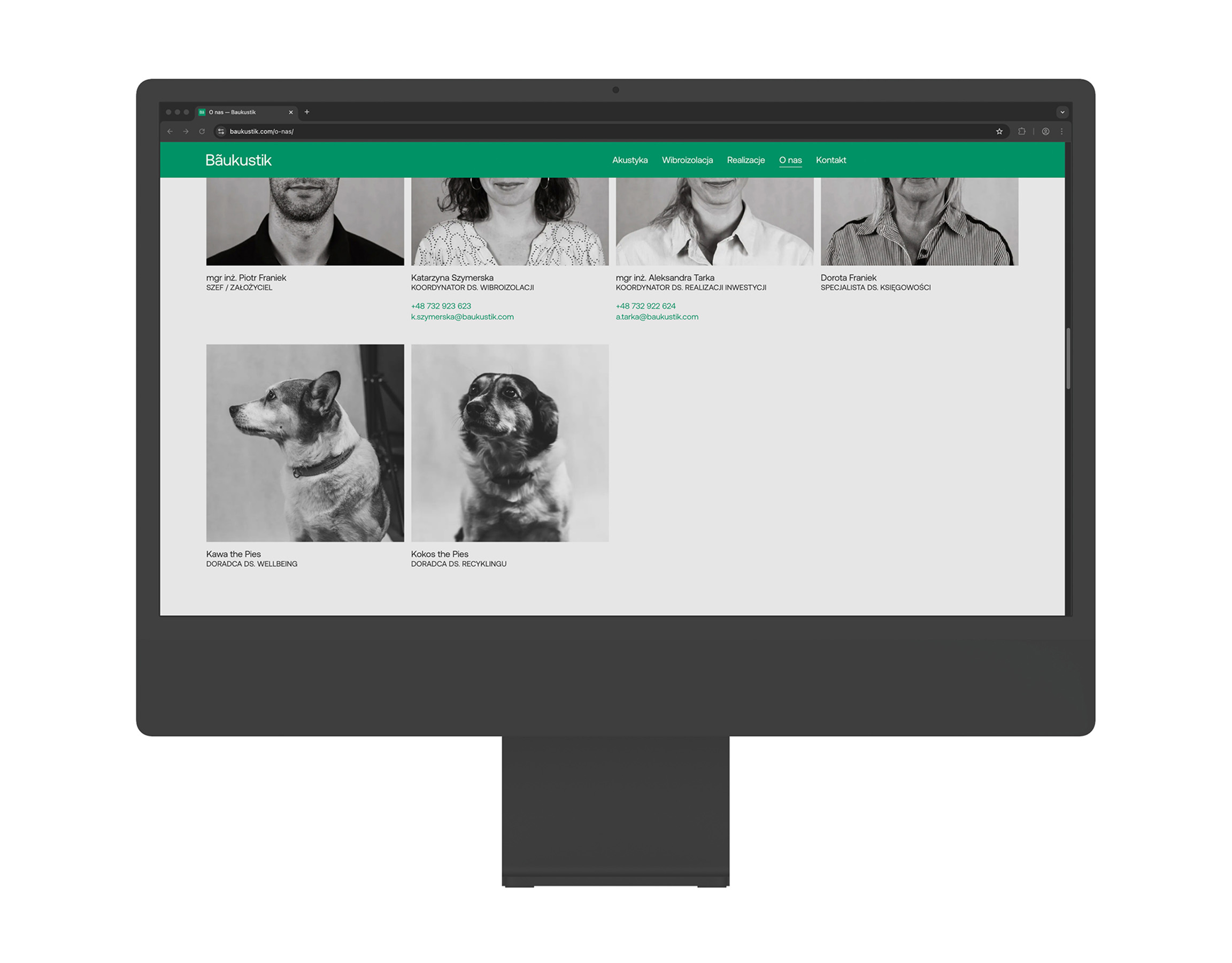
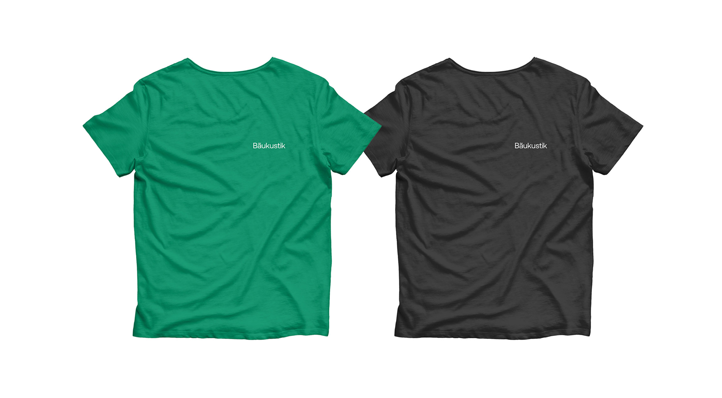
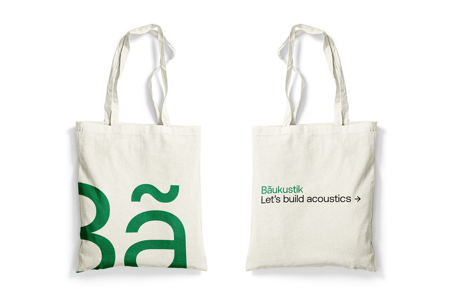
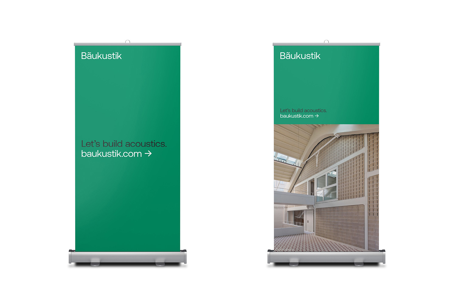
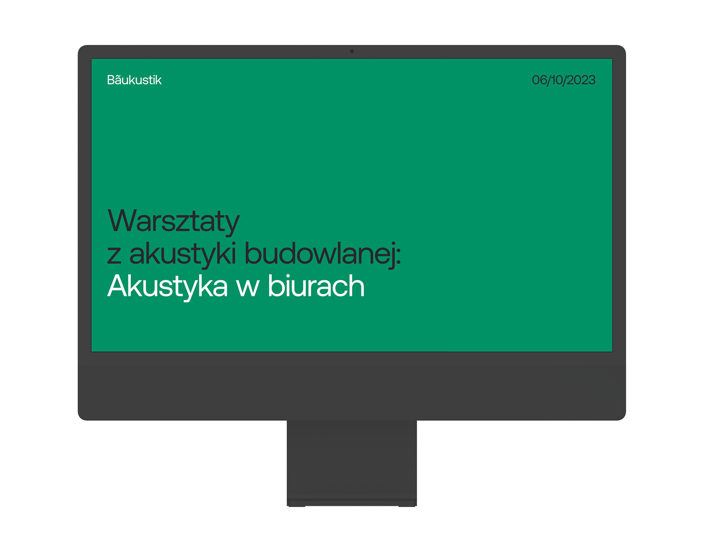
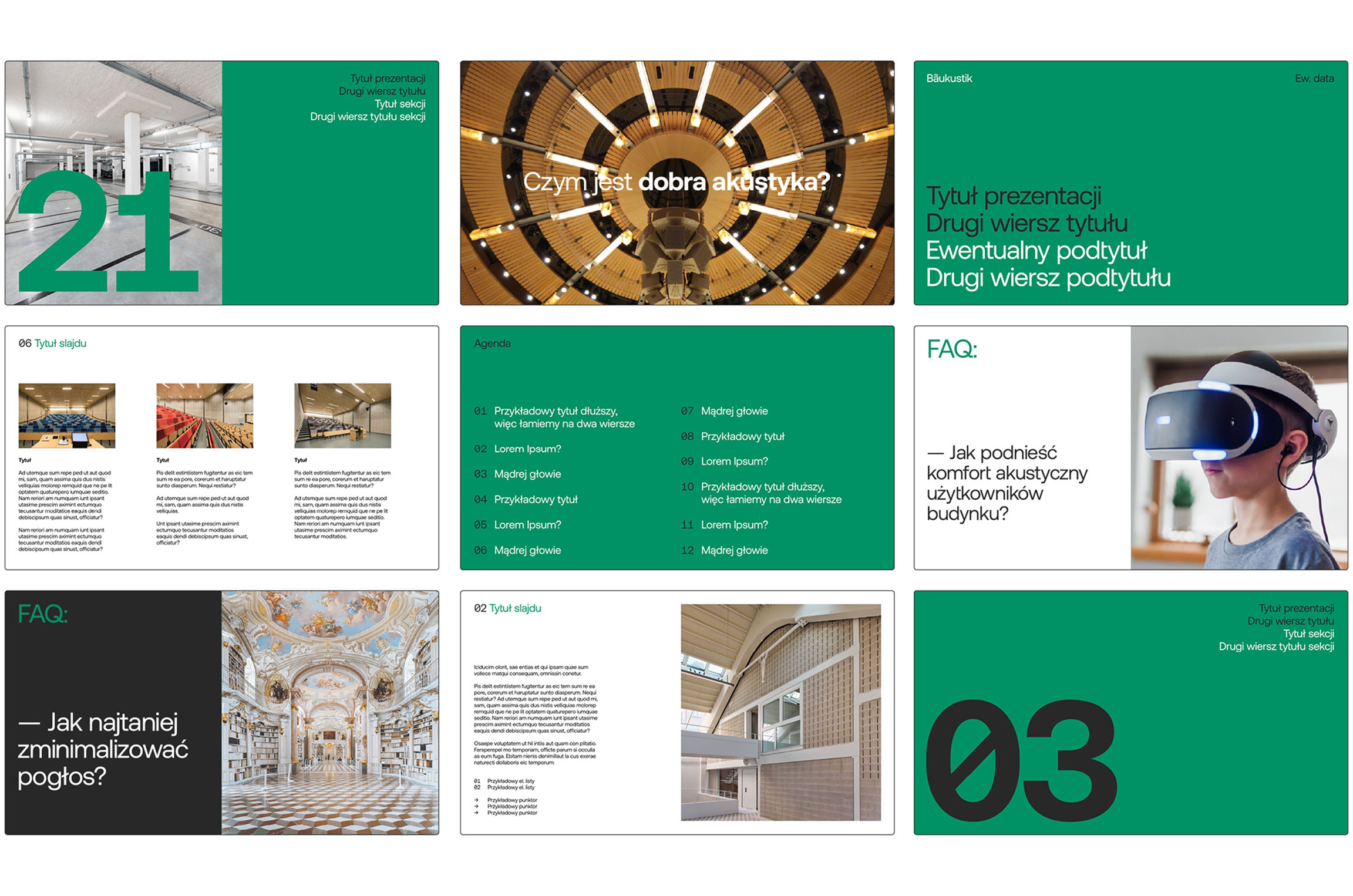
I based the Baukustik identity on the Aeonik typeface, which is a warm but still minimalist adaptation of modernist typefaces from the 1950s. Later, I designed a complete branding for a modern company: business cards, stationery, technical cards, printed catalogs, presentation templates, advertising templates, company gadgets, and a website.